
This project is a collaboration between David Jimenez, Charles Kaioun, Celeste LeCompte, and Léa Steinacker.
In San Francisco, there is a growing concern about residential fires, which have displaced more than 100 residents from their homes since the beginning of the year. Have there been more big fires? If so, why? We turned to the data to answer the question.
 Read on for more background on our analysis.
Analysis: Beware of data!
This should be the warning applied to all datasets and visualization tools. Illuminating and bringing a new perspective with data is key to asserting ideas, but using the wrong dataset or presenting the right one falsely is as easy as discovering new information.
We started working on building fire data from the San Francisco Fire Department and news reports, alongside the San Francisco Public Health Department’s no-fault evictions data. We came up with a nice map overlaying the two datasets:
Dots are fires — the redder the dot, the bigger the fire. The shaded areas on the map show the rate of evictions — the darker the shading, the higher the eviction rate.
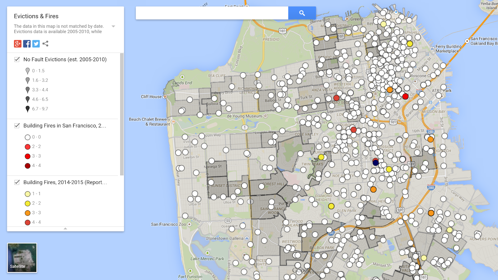
You could easily look at these maps and draw the conclusion: more fires happen where there is a lower eviction rate, or there is a higher eviction rate in zones with fewer fires.
But, look more closely, and you’ll see that this conclusion is flawed.
First, the datasets come from different time frames and sources. The published evictions data is from 2005-2010, while the fire data is available from the city 2011-2012 and collected from news reports between August 2014 and the present.
Second, the evictions data is only available by block group over the entire time period; by averaging the data this way, it erases the change and movement of eviction patterns over time.
Finally, causation is a very subtle thing to test — even with good datasets and strong correlation, this is not so easy. I invite you to check this website (http://www.tylervigen.com/) if you don’t trust me.
We aren’t the only ones asking these questions. An online mapping project has attempted to answer some of these same questions with their own data visualization. However, their maps have many of the same problems — and other problems — as those we tested.
But having wrong data and wrong visualization is not solely the fault of the writers — it’s also on the data providers. Aiming for more transparency and informing people is a noble quest, but doing it wrong can lead to disastrous effects such as this one. The San Francisco Fire Department not only stopped publishing its public data after mid-2012 (though you can request it with a 10-day lead time), the data it provided was full of duplicates, unclear, and very difficult to fetch. (I invite you to check the way they do it, a collection of XMLs with incremental data encapsulated in ZIPs… a real pleasure…).
If cities want to embrace open data, they need to find better ways to publish, maintain, and support the information they’re making available.
Updated with revised image, April 8, 2015, 8:45am
Good piece highlighting the challenges of data journalism (sources, data integrity, correlation/causation).
I was not able see an enlarged version of the infographic.