Research Funding at MIT

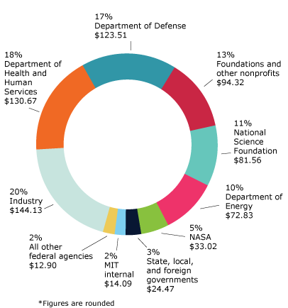
In 2018, MIT spent $731 million through research expenditures. A large portion of the money came from federal sources like the Departments of Defense, Energy, Health as well as NASA and the National Science Foundation. Within the $731M, $144M came from industry sources like IBM, Google, Lockheed Martin, Exxon Mobil, Wal-Mart, Toyota, and Capital One to name a few.

I got curious in MIT’s funding sources when Fossil Free MIT campaigned for the school to divest its endowment from fossil fuels and President Reif declined. Among the possible reasons for his decision, I wondered what MIT had to lose financially. Two potential reasons that stood out were career opportunities for students and research funding. Showing the first with a counterfactual would be difficult, and I was more interested in the second scenario. I found that the data published in the Brown Book could go a long way towards answering my question.

(The Brown Book is not a public document so I will share aggregate values, not sponsor level values on this post. See the note at the end and stay tuned for more this semester.)

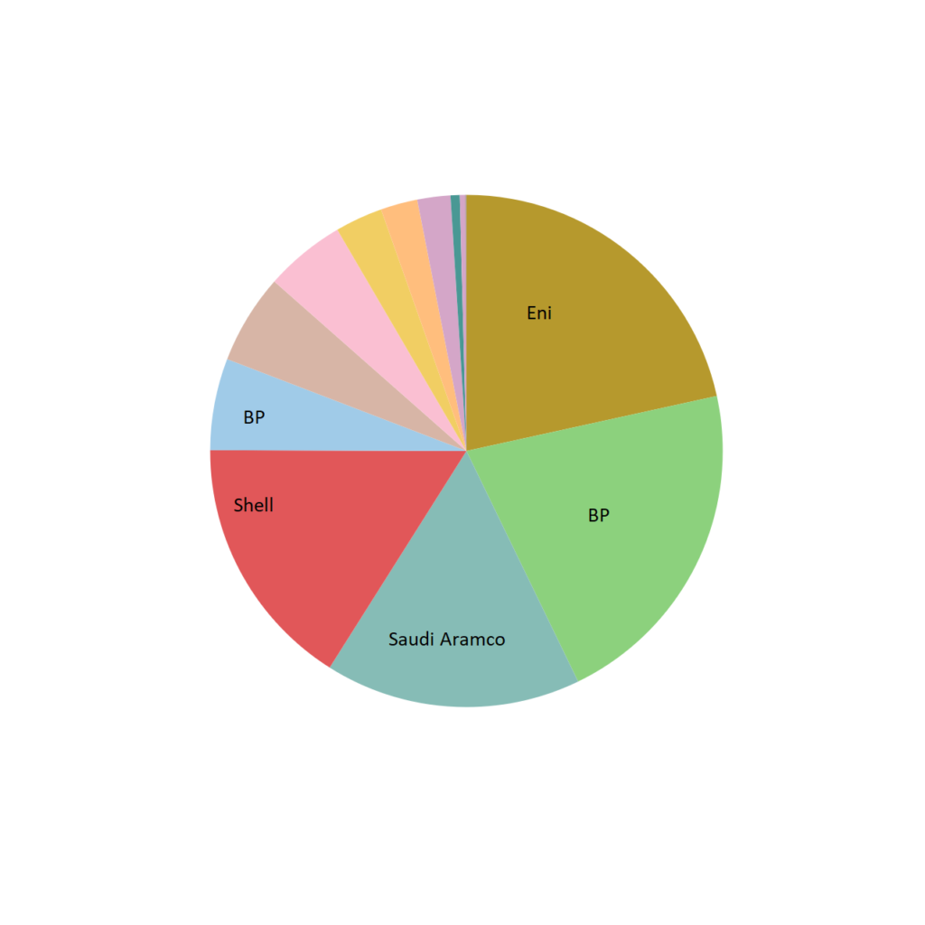
While the analysis is still ongoing, here’s what I’ve found for 2017: about $720M of sponsored research funding was spent that year by the report was made. If 20% came from industry like it did in 2018, $144M of industry funding was spent. By a manual search for companies whose business is predominately fossil fuel energy, MIT spent $21.2M of fossil fuel money, or 14.7% of industry funding.

Total pie area represents approximately $21 million.

It would be a logical jump to say that 14.7% is a good or bad number. Each company has varying levels of commitment to sustainability as well as their history with acknowledging climate change. Additionally, one caveat is that although the money comes from profits derived from fossil fuels, the research may in fact be for clean energy. To find out, analysis into other documents published in the Brown Book is necessary (but hasn’t been done yet).

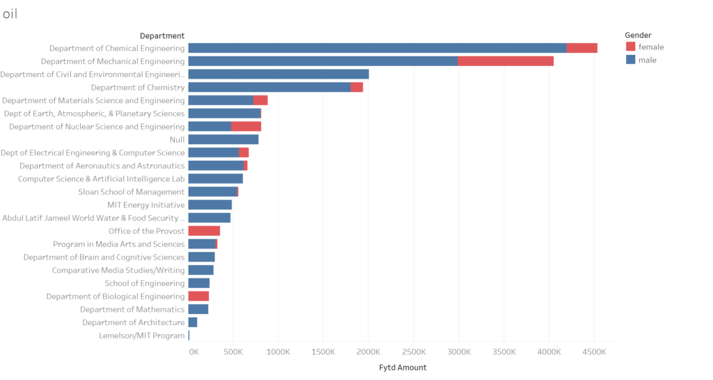
Other analysis I’m incorporating is look where the money flows to within MIT at the departmental (or similar) level as well as gender.

Made in Tableau

The focus of funding in the chemical and mechanical engineering is logical. The null values in the figure arise from faculty that I haven’t been able to assign into a department using an automated tool that searches MIT’s online directory. This prevents me from putting the values in the figure above into context of the respective department’s spending.

My larger goal is to create a financial transparency tool via interactive data visualizations accessible to all of MIT. I’d be curious to hear what other kinds of analysis you’d like to see or better ways to convey the narrative in the visualizations.

Health and Wealth in Singapore

I approached this assignment with a data-first, narrative second perspective. I work on developing strategies for combating vector-borne diseases so the allied fields of epidemiology and geography seemed like a promising place to look for a story. One of the major vectors for diseases that affect humans (i.e. Zika, dengue fever, malaria, chikungunya) is the mosquito. There are several different kinds, but for the most part, they share a common taste in habitat. Places that are close to water, particularly stagnant freshwater, and get warm (as low as 60F, but ideally 70-80+ F) As I poked around the web trying to find workable datasets with this in mind, I came to find well-indexed mosquito and vector-borne disease maps from Singapore, provided by the government. I used Google MyMaps to create layers on this map that you can use to toggle between the overlays and I’ll walk you through some of the highlights.

One of the first things to know about Singapore, from an epidemiological perspective, is that it’s dense. There are over 5 million people living in an area under 300 square miles. Its the third most densely populated country in the world. While its very prosperous, it also faces a high level of income inequality — more unequal than the US and on par with Equador and Saudi Arabia (according to its Gini coefficient).

There were over 3000 cases of dengue reported in Singapore in 2018 an while the government maintains a high level of engagement in managing mosquito populations, the problem remains endemic. The National Environment Agency provides records of the location and number of reported dengue cases over a 14 day cycle, the last of which ended on November 7th, 2018.

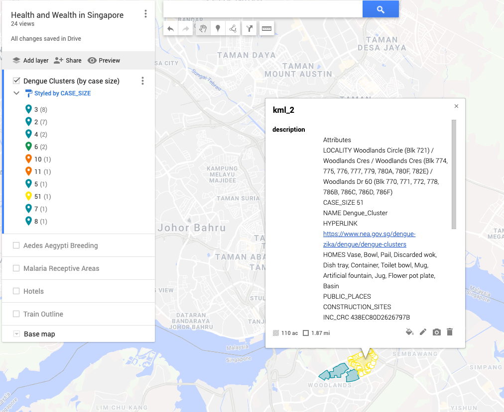
This is a heat-map of the clusters of dengue fever in Singapore. The areas that are blue-green are clusters in the single digits and the double digits are in orange and yellow. We can see that cases not evenly distriubted throughout the country and most clusters are within a mile of another cluster.

Zooming in on the largest cluster, with 51 cases (just under half of the total of all sites), we can see that the areas of stagnant water (where mosquitos breed) were found exclusively in homes. Water collects in every-day, household-objects, as is does in public places and construction sites. It seems personal homes, perhaps due to lack of knowledge, are the entry point for the spread of the disease. This is a question we can explore further by looking at where the breeding sites for aedes aegypti were found in the graph

Overlaying the aedes aegypti breeding sites with the dengue clusters, something interesting pops up — the graphs don’t match. While there are breeding sites in areas that there are clusters, there are not clusters everywhere there are breeding sites. This is interesting because it indicates that there is something going on, education, norms, or otherwise, that is breaking the line of transmission in these areas. But, you could say, maybe what we see in the breeding overlay is actually a representation of all the areas where aedes aegypti mosquito breeds and not all mosquitos have the virus responsible. In which case, the next map to look at would be the overlay of the areas receptive to malaria

In the above map, the “natural” habitat suitable for the malaria vector (anopheles gambiae) serves as a proxy for “natural” habitat suitable for aedes egypti. This overlay shows that a large portion of the mosquito breeding sites are, in fact, outside of the malaria receptive areas. While this map can party be explained by a lack of sampling depth for breeding grounds in the receptive areas, the fact remains that areas that were not expected to be breeding grounds simply are. Life in the Anthropocene for the mosquito is booming.

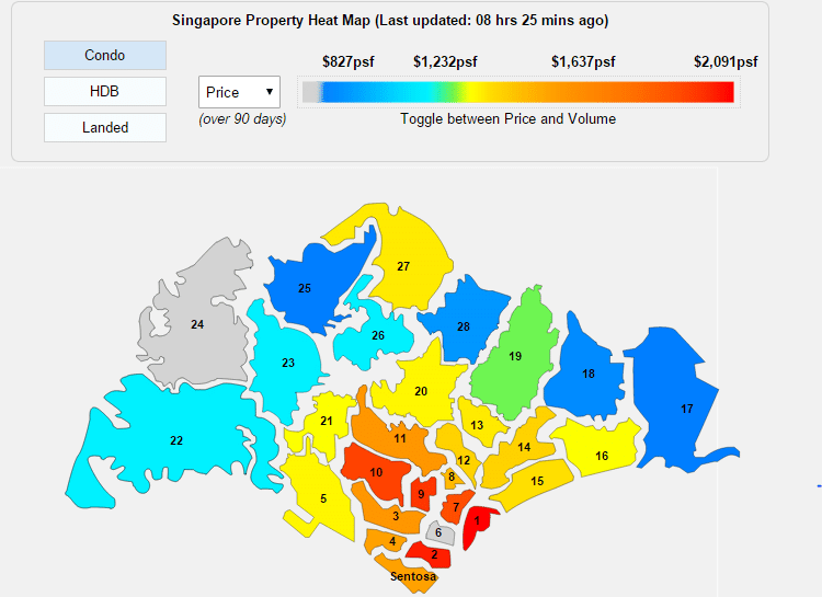
Taking a step back and looking at the dengue clusters in relationship to the hotels, we can get a sense of the places that tourists are likely to be. This can serve as a proxy for areas that might be thought of as desirable. It surprised me to see that while there are some clusters close to hotel locations, the hotels seem to carefully avoid them. I was then interested to delve into looking at how sharp the economic divide might be at those borders. While I wasn’t able to find data that was easily transferable into the format of this map, below are two maps that can give some insight. The first is of the train-system throughout Singapore and the second is a property heat-map. I chose to look into the train system to see if there was a relationship between transport hubs and dengue clusters in terms of 1) disease mobility and 2) if economic centres (well-serviced by transit as a proxy) faced the same intensity of disease compared to less economically active areas. While perhaps useful, these might be questions that are beyond the scope of this assignment. The property heat-map can give some more understanding of where the affluent and economically disadvantaged live.

Bajaj, Abhishek. (2015). Exploring Urban Poverty in Singapore A lens on the influences acting on a child growing up in a lower socioeconomic environment. 10.13140/RG.2.1.4880.7767.

Death by Compounding

Jason and I collaborated on this and he’ll be writing up our final blog post; in the meantime click the image above to go to an interactive visualization of pharmaceutical compounding errors in the US!

Visualizing the West Virginia Opioid Crisis

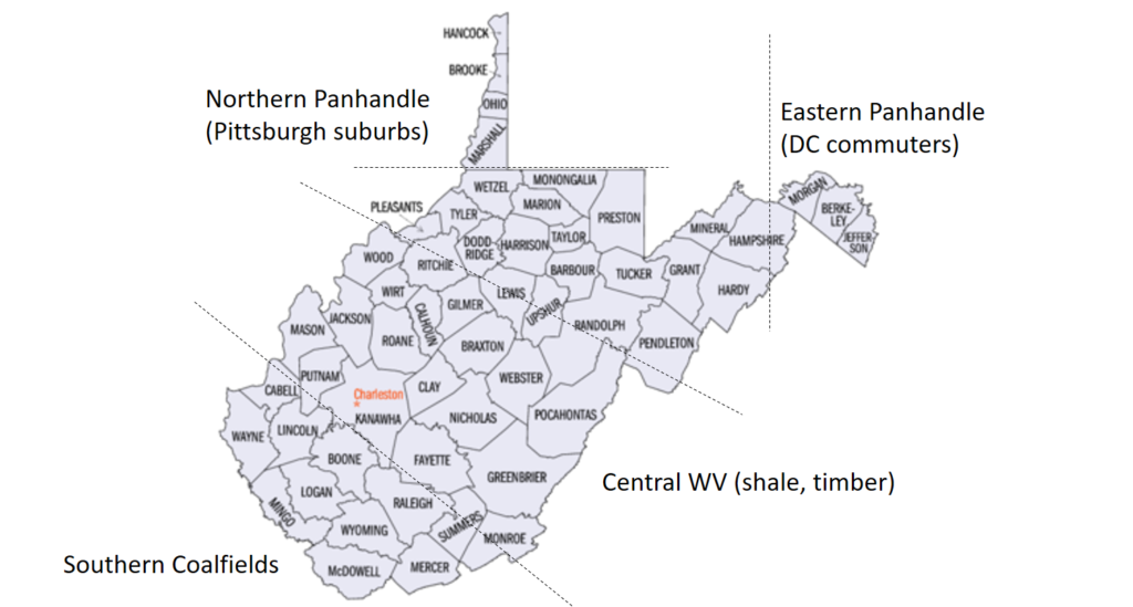
Having just returned from two weeks in West Virginia working on an economic development project in Appalachian downtowns, I was interested to look at opioid death (easier than use) statistics by county. However before getting into the data, it’s worth taking a look at one generalized take of regional differences in the state.

Annotations based on interviews with community leaders across West Virginia.

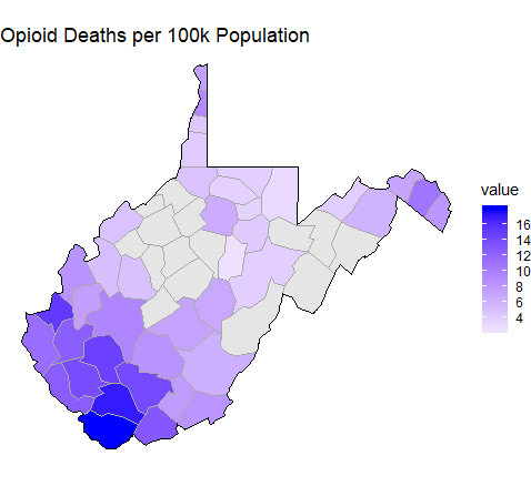
With these regions in mind, opioid death rates are particularly stark.

Data is from CDC Wonder database. Grey counties do not report opioid deaths.

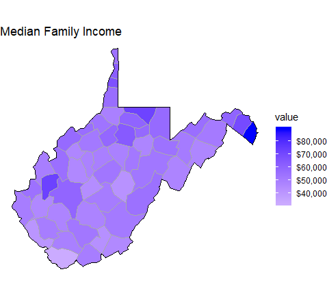
This “Southern Coalfields” region clearly shows a significant opioid problem, and is moreover economically depressed (as seen below). Opinions among community leaders in the state differ on how government and community institutions can and should address the problems in southern West Virginia.

Source: 2017 American Community Survey.

From its history as a leading coal mining state, West Virginia is struggling to re-invent itself as an outdoor tourism hub and an exporter of timber and natural gas. However to support this redevelopment effort, West Virginia needs a healthy workforce. How federal, state, and local institutions respond to maps like the above will define whether West Virginia can successfully navigate a post-coal economy.

Busting HBCU myths with data

By Jeneé Osterheldt and Tyler Dukes

There’s a long-standing myth that Historically Black Colleges and Universities, or HBCUs, do a poor job graduating their black students.

According to U.S. Department of Education data, only 4 out of 10 black students graduate “on-time” — that is, within six years of starting their freshman year.

Weighted average of graduation rates for black students at 84 HBCUs reporting to the U.S. Department of Education as of 2014 within six years of their start date, or 150 percent time. SOURCE: Integrated Postsecondary Education Data System, PartNews analysis

Compared with colleges and universities overall, the number of black students who graduate on time is closer to 5 in 10.

Weighted average of graduation rates for black students at 1,671 colleges and universities, including HBCUs, reporting to the U.S. Department of Education as of 2014 within six years of their start date, or 150 percent of the time. SOURCE: Integrated Postsecondary Education Data System, PartNews analysis

So what’s the deal?

Jay Z says numbers don’t lie, but they don’t exactly paint the whole Picasso either. It might seem like HBCUs have a low grad rate — but it’s just not that simple.

If you plot graduation rates for black students against the percentage of first-generation students at a college or university, it looks a little something like this.

Approximate plot of percentage of first-generation students (horizontal axis) vs. graduation rates for black students (vertical axis) in 2015 for about 1,600 colleges and universities reporting to the U.S. Department of Education. SOURCE: US DOE College Scorecard, PartNews analysis

The general trend is that the higher the percentage of first-generation students, the lower the graduation rate.

And that’s an important relationship, because when we look at where HBCUs fall on this plot, they tend to be scattered around here, toward the lower end of the graduation rates and the higher percentage of first-generation students.

Approximate locations of 85 HBCUs inplot of percentage of first-generation students (horizontal axis) vs. graduation rates for black students (vertical axis) in 2015 for about 1,600 colleges and universities reporting to the U.S. Department of Education. SOURCE: US DOE College Scorecard, PartNews analysis

On average, about 43 percent of students enrolled in HBCUs are first-generation. Compare that to about 36 percent for colleges overall.

Another factor: Money. According to a Pell Institute study students from families in the top quartile (over $108,650) are eight times more likely to hold a college degree than a kid from the bottom quartile (under $34,160). About half of the nation’s HBCUs have a freshman class where three-quarters of the students are from low-income backgrounds.

About 50 percent of the nation’s HBCUs have a freshman class where 75 percent are from low-income backgrounds.  SOURCE: Pell Institute

But just 1 percent of the 676 non-HBCUs serve as high a percentage of low-income students.

That bag makes a difference. Not to mention, the schools themselves see less resources.
According to the Thurgood Marshall College Fund, HBCUs have one-eighth the average size of endowments than historically white colleges and universities.

And consider the open-admission policy. HBCUs are more likely to accept students with lower grades and SAT scores than other institutions. The Post Secondary National Policy Institute found that over 25 percent of HBCUs are open admission institutions compared with 14 percent of other colleges and universities.

Despite the odds, HBCUs still make a major difference to their student bodies. These schools, which on the surface may seem to do a poor job at graduating black students, helped create the black middle class. At least that’s what U.S. Commission On Civil Rights report says.

Historically Black Colleges and Universities have produced 40 percent of African-American members of Congress, 40 percent of engineers, 50 percent professors at PWIs, 50 percent lawyers and 80 percent of judges.

And to think, HBCUs only represent 3 percent of of post-secondary institutions. Just saying: imagine what these schools could do with more funding and support.

Long live black excellence.

Movie Success: Is it in the Data?

By Dijana, Maddie, and Sruthi 

Despite all of the talk every year about how out of touch the entire award ceremony and results are, everyone in the film industry wants to win an Oscar. It’s the most prestigious award in the industry, signifying the recipient being at the top of the field. Regardless of the flaws of the voting process, which is completely subjectives given the voting constituency, the number of Oscars a film wins is more often than not the main measure of a film’s success.

But is there some other factor that contributes to that success? Do the film critics sway the voters? Does public sentiment push movies into Oscar contention? Is there some correlation between the revenue of a movie and it’s Oscar potential? Does spending more on the film lead to more wins?

Using data sets that included quantitative data from IMDB, the American Film Institute, and Box Office Mojo, it’s clear that some factors have a stronger relationship with Oscar wins than others.

(Budget) Size Doesn’t Matter

Click to see full image

After charting the relationship between Oscar wins and the adjusted budget of each film released from 1928 to 2010 (with some omissions due to the incomplete data set), it’s clear that the cost of the movie has no bearing on its overall success. Very rarely are the big budget movies major winners at the Academy Awards. In fact, only Titantic, a film that cost approximately $200M to make, has a significantly large budget in film terms.  

There may be many inferences to make from the data, such as the fact that the most expensive movies tend to be summer releases geared for the general population as opposed to the serious film crowd. Budgets may be increasing for films over the last several decades (see graph below), but the number of films winning a significant amount of awards has not increased. However, given the lack of available data, these points remain speculation.     

Click to see full image

Mo’ Money, Mo’ Oscars?

The size of a budget may not signal a greater probability for a film to win more Oscars, but about overall revenue? Does the box office success matter for the Academy voters?

Looking at the data from Box Office Mojo of the 25 movies released before 2011 with the highest domestic grosses, adjusted for inflation, it’s clear that there is no significant relationship between revenue and Oscar wins.

Click to see full image

Academy members aren’t swayed from box office smashes when it comes to choosing Best Picture. Though there are a few outliers, such as Gone with the Wind and Titanic, that have earned a significant amount of revenue at the box office as well as Academy Awards, for the most part more revenue does not signify more Oscars. In fact, 6 of the 25 movies did not win a single Oscar, and three only won one Academy Award.

The People vs. Oscar Wins

In the film industry, an Oscar is an incredible achievement, signifying the quality of the end product and the work that went into creating it. But does the public see these films in the same way? Just how popular are the most successful movies?

Using data from the IMDB database, the rating of each film (which any IMDb.com visitor can vote on) was compared to the total Oscar wins:

Click to see full image

Surprisingly, the most popular film on IMDb according to the public rating at 9.2 out of 10 is The Shawshank Redemption, a film that while nominated for seven Academy Awards, came away empty handed. On the other hand, two of the three films with the most Oscar wins (11), Titanic and Ben-Hur failed to make the top 250 ratings on the website, with ratings of 7.7 and 5.7, respectively. The Lord of the Rings: Return of the King is one of the few films that bucks this trend, with a rating of 8.9 and 11 Oscar wins.

But What Do the Experts Think?

When it comes to measuring the success of a film, one major group has been ignored thus far: film experts, including historians and critics. To get a better sense of how much expert opinion matches up with the Academy’s, the American Film Institute’s list of top 25 movies of all time (up to 2010) was used as the primary source for analysis:

Click to see full image

Much like the previous analyses, the number of wins does not match up well with the ranking. While several movies, such as Gone with the Wind, Lawrence of Arabia, and On the Waterfront, each won several awards and were ranked in the top 10, the top film of all time, Citizen Kane, only won one Oscar. Even more surprising, several of the top 25 films, including Singin’ in the Rain, Psycho, and It’s a Wonderful Life received zero Academy Awards.

Of course, several caveats must be made with the data. The number of total categories and therefore possible wins has increased substantially from the first Academy Awards in 1928. Similarly, there is no way to determine the competitiveness of the field in a given year. There’s no way of knowing if a film that is highly regarded by critics and the public would have won more awards if it was released in another year.Additionally, not all Oscars are created equally, and more weight may need to be applied to categories like Best Picture and Best Director over others.

Despite the issues with the data, one thing remains clear: Oscar wins may be a measure of success for the industry, but it very little, if any, evidence that several criteria matter when it comes to predicting success. So instead of trying to use an IMDB rating to predict the next Oscar winner, it may be better to just guess blindly.

Where are Pulitzers Won?

Yesterday saw the announcement of the 2017 Pulitzer Prizes. Awarded in some form or another for one hundred years, the Pulitzers represent the peak of journalistic recognition as well as literary and musical accomplishment.

Though the categories celebrating journalism have shifted somewhat over the years, the Pulitzers have long recognized quality reporting at all levels, from the local to the international. So what can analysis of who won the awards tell us about the geographic spread of successful journalism?

For this assignment I analyzed where four different categories of Pulitzers were awarded over the course of the last century. First, I looked at the Pulitzer for Local Investigative Specialized Reporting, a category awarded since 1964. Scraping the data from a list on Wikipedia, I calculated the number of awards given to titles in each U.S. state, and used the visualization tool Datawrapper to display the results:

backup link: //datawrapper.dwcdn.net/1rbUv/2/

23 out of 50 states have seen a title win a Pulitzer for local reporting – a decent geographic spread. Next I looked at the prizes for National and International Reporting respectively:

backup links: //datawrapper.dwcdn.net/399c2/2/

//datawrapper.dwcdn.net/kE4ZQ/2/

As these charts show, larger states have tended to dominate the National and International categories, which makes sense given the consolidation of resources in large bureaus, particularly in New York and Washington. For international reporting especially, New York dwarfs all other states, accounting for well more than half of all International Pulitzers.

Yet the Public Interest category, displayed below, shows much more geographic diversity. Though New York and California, as large states, still lead the way with 10 prizes each, Putlizers for work in the public interest have been awarded to fully 31 states plus DC, and states like North Carolina (6 awards) and Missiouri (4) have been frequently recognized.

backup link: //datawrapper.dwcdn.net/esVb3/1/

This analysis suggests that while major titles like the New York Times and Washington Post have long lead the way with their hard-hitting reporting at the national and international levels, for a century now, newspapers at every level and in a majority of states have performed award-winning journalism in the public interest. These local titles, exposing municipal corruption and state-level scandal, are the backbone of American journalism and – facing the most danger from the loss of advertising revenue and corporate consolidation – are most in need ongoing financial support.

Sruthi’s Media Diary

The big picture

By Tuesday (21st of Feb) early morning, I tracked about 5.5 days of media usage totalling about 46.6 hours. I used 4 distinct sources of technology – Macbook Air, iPhone, Echo and paper. I used RescueTime to track usage on my laptop, Moment app to track usage on my phone and my good ol’ brain for the rest.

Using a top down approach, following was my overall media usage broken down by category:

 Source: RescueTime, Moment and personal data collected; chart built using Plot.ly

My media usage amounts to about 35% of my day (46.6 hours out of 5.5 days tracked). I spend the rest of my day commuting (without using media), in class, meetings, running errands, socializing, working out and sleeping. Given sleeping forms a third of my day (7 hours per day), my media consumption though significant is not a very bad statistic.

Takeaway 1: Multiple media sources form the 35% daily average media usage for a multitude of tasks

From the smallest to the largest source of media consumption…

Echo (daily average ~ 10 minutes)

Echo has been primary news source in the last week. I listen to headlines and short articles from NY times, WSJ, BBC and Economist as I get ready for the day.

Usually I try to scroll through my NY times, WSJ and BBC phone apps but the usage has been minimal in the last week.My news app usage varies but I find myself needing 15-20 minutes to go through all my news apps during the morning but I haven’t allotted the time since being back to school. I usually listen to news podcasts (economist and WSJ) on my walk to school, but given the snow / weekends my podcast listening has been non-existent.

Takeaway 2: Consume news (mostly headlines) during commute / multi-tasking

Print Media (daily average ~ 1-2 hours)

My print media usage is usually restricted for class readings – articles and cases. Given I am taking 5 courses this semester, all of which are qualitative, it makes sense to read 1-2 hours on a daily basis to prepare for my average 2 classes per day.

Takeaway 3: Print media restricted for coursework ~ associating print with serious media consumption

iPhone (daily average ~ 1.6 hours)

While on average my iPhone usage is around 1.6 hours per week, following is a snapshot of my phone usage for a single day which is reflective of my day-day consumption. I learnt a lot about my phone usage habits and they were pretty consistent with my love of productivity and addictive Instagram usage habits.


Using Moment app on my iPhone, I was able to track app usage by minute, location and time of day. Following is a snapshot for last Monday (20th Feb):

1. Throughout the day, I check my phone 60 times, that means on average once every 17 minutes (excluding 7 hours for uninterrupted sleep time) … clearly a sign of addiction. I used the phone, per check, anywhere from 2 minutes to 44 minutes with a median of 3 minutes, which reflects my fairly short attention span.

2. Home screen – I spend majority of my time using the home and lock screen, which is where I receive alerts from my various news apps. This indicates my sad habit of consuming news headlines in terms of alerts (I mostly get updates from news apps and outlook and check my phone periodically as my phone is always on night mode).

3. Productivity, productivity, productivity apps – sweat, outlook, weather, notes, app store – my focus has been on working out, emailing / checking calendar, taking quick notes, checking weather and getting more apps to improve my productivity. I am not surprised or shocked by the usage numbers given I feel I am at a minimal time per app.

4. Social networking – Facebook, Instagram, Whatsapp – my Instagram usage is alarming. I have a preference for visual media consumption especially given my interest in following influencers in food, travel, health and fitness space. I feel Instagram is best suited to connect with influencers and brands I like.

Takeaway 4: Spend time reading in-depth investigative news articles rather than consuming news updates

Macbook (daily average ~ 3.8 hours)

I primarily love using my laptop the most because of the screen space and find it most convenient to use the laptop for both work and entertainment.

  1. Too much entertainment – According to my RescueTime dashboard, I spend 40% of my time on entertainment and rest on more productive applications like outlook and excel. Following is a screenshot of my overall usage last week by top applications used:Source: RescueTime dashboard
  2. Timeline analysis – I created the following heatmap for my three main categories (entertainment, communication and design) to understand my hourly usage patterns across the last few days. The richer the color, the more time spent in that category.

Source: RescueTime data; heatmap built with excel

My main takeaway from my usage indicates that I have productive work hours from 9 am till 8 pm and during the rest of the time I waste my time consuming Netflix for entertainment purposes.

Takeaway 5: Give up Netflix!!!!

Overall, I notice my media consumption is very self-centered in serving my own interests. I would be curious to learn how to a non-participatory citizen, such as myself, to be influenced by subjects outside my interest areas and how these topics could enrich my life.
What does Hillary Clinton’s Inbox look like?

I, too, am tired of hearing about Hillary’s use of a private email server. On the other hand, it led to a pretty neat data set to unpack: a dump of emails she’s sent and received.

I played around with this data set a bit and was particularly interested in how different groups of people interacted with Hillary. Did men use shorter sentences than women, for example? Did her staffers send one-liners versus ambassadors who sent lengthy emails? Did she have interesting relationships with people we might not be familiar with?

I didn’t get a chance to answer all of these questions, but I ended up being interested in the way words in her email were clustered, and decided to come up with a visualization based on that.

For a simple representation to start, I created a scatter plot visualization using mpld3, which creates interactive matplotlib graphs for the browser. It’s clunky to navigate (you need to switch to a zoom-in mode, drag a rectangular portion of the graph to zoom in on, then switch again to the cursor mode to scroll over words), but it’s interesting to see which words appear together for a first step.

Isn’t it interesting that “bipartisan” appears well outside the main cluster of words?

Isn’t it interesting that “bipartisan” appears well outside the main cluster of words?

Lesson learned along the way: visualizing text is hard. I found that the norm for text visualizations out there, such as word clouds or circle packing, was reductionist for some of the data I have, like topic models or k-means clustering.

While I didn’t create data visualizations for some of the questions I posed earlier, I do have some statistics:

For males:

6187 sentences
83764 word tokens
10762 word types
7.78 average tokens per type
13.54 average sentence length
5.01 average word token length
7.34 average word type length
Hapax legomena (words that appear only once – an indicator of vocabulary usage) comprise 49.60% of the types

For females:

22845 sentences
369517 word tokens
30386 word types
12.16 average tokens per type
16.17 average sentence length
4.94 average word token length
7.84 average word type length
Hapax legomena comprise 49.76% of the types