Old and New Collide at Harvard Art Museum’s Lightbox Gallery

In November 2014, after the three stalwarts of the Boston art scene–the Fogg Museum, Busch-Reisinger Museum, and Arthur M. Sackler Museum–became one institution under the Harvard Art Museum, a smaller, experimental gallery launched within its walls under the masterful direction of Harvard’s metaLAB, “an idea foundry, knowledge­-design lab, and production studio dedicated to innovation and experimentation in the networked arts and humanities.” The space was designed to push the boundaries of an otherwise traditional museum space through, “digital experiments and new media projects that respond to collections held at the Harvard Art Museums.”

The entirety of the room is covered with screens, projectors, network jacks and various other necessities that would make any experimental artist salivate. But what might make this gallery most exciting is the juxtaposition of next-generation tech, and the traditional artworks of the museum.

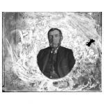
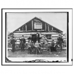
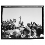
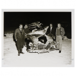
Nothing feels more well-suited to this surprising marriage than the upcoming video exhibiton “YOUR STORY HAS TOUCHED MY HEART,” opening May 23. The exhibition highlights the truly extraordinary American Professional Photographers Collection, over 20,000 photographs depicting American life in the late 19th and early 20th century.

The photographs depict the hopes and dreams—and fears—of Americans as they imagined themselves at their best. Your Story Has Touched My Heart combines these photographs with new video footage, sound, and fragments of text that put the work in dialogue with memory, individuality, ephemerality, and the meaning of visual abundance as these images find their way in the digital realm.

– metaLAB

A special screening will be held on May 25, followed by a discussion of the video and corresponding works by the metaLAB’s Matthew Battles and Sarah Newman, in concert with one of the APPC’s curators, Professor Kate Palmer Albers.

The 20,000+ collection is impressive both in its size and the consistent quality of the photos and negatives. To gain more exposure before the event, follow our Boston Bot on Twitter, and receive periodic links to images in the collection!

Alfie: The Audio Butler

(Team: Brittany, Sravanti, Ashley D.)

As avid listeners of public radio and podcasts, we found ourselves wondering why it would be easier to book a trip to Timbuktu from our phones than to share an interesting clip from the latest episode of This American Life on Twitter. Most of the media we consume doesn’t have this problem. You read or watch, you export a link directly to social media with your comment and call it a day.

We have watched with interest as several notable names in audio – This American Life included – have taken steps to address this shareability gap with mixed success. Whether it’s klpr or Clammr, audiograms or Audible or Anchor, there does not yet appear to be a complete solution to sharing audio content with your networks. Either it isn’t user-driven or it isn’t integrated with the social media platforms people are actually using.

Part of the problem, we learned, is the internet itself – it simply wasn’t built with audio in mind. And the user experience for audio often remains laborious, even if the listening experience can also be serendipitous and the friend of multitaskers everywhere. Several knowledgeable people have explored why audio doesn’t tend to go viral (and when it might) – but we aren’t necessarily looking for virality. We’re looking for something deeper, something that befits the level of engagement that makes this medium uniquely valuable.

If podcasts are truly the last undiscovered country, the media market poised for continued growth rather than decline, we deserve a set of tools that allows us to easily and readily build a community – a conversation – around that content. Especially for those citizen journalist podcasters out there, all around the world, who are trying to build an audience and generate some dialogue around their grassroots endeavor.

So we set out to prototype a mobile application that would act like a sharing plug-in, overlaid on top of existing listening platforms. (Of course, this would require those platforms to integrate such an app, and while we feel it would be in their best interest to do so, let’s agree to suspend disbelief for a few minutes.) This application, which we’re calling Alfie the Audio Butler, allows the user to 1) export a cool clip to Facebook or Twitter, 2) annotate as they listen and see what their existing social networks have to say about the same content, and/or 3) leave a comment with their own voice. It’s immediate, it’s simple, and it’s on-the-go.

You can check out the interactive prototype below (thanks to Ally Palanzi’s Clipper on github for getting us started with the code), including some demos geared toward this audio story we reported on the subject:

Demo “Alfie” here.

Alfie_screenshot


alfie_screenshot2

Spring 2015 Final Projects

This past Wednesday, students in the Spring 2015 Future of News and Participatory Media presented their final projects. Below are summaries of each project:

  1. “It Gets Smaller” – Léa Steinacker, Charles Kaioun, Gideon Gil, Luis Orozco, Melissa Bailey, Melissa Clark

Student debt is a serious problem: the average debt per student in the U.S. is $30,000. Léa explains the problems facing students who are looking at taking a loan: too much information dispersed across multiple sites; existing debt calculators are offered by for-profit platforms with questionable motivations; and people often feel isolated and alone in their quest to fund their education.

With It Gets Smaller, students can input the amount of debt they will have and what they are majoring in. Then, they are offered tools to help them see how the amount they will owe each month might change depending on different parameters. They also offer students a way to connect with other people who are facing similar debt circumstances.

It Gets Smaller helps journalists better understand student loan issues by connecting them with communities dealing with debt. They created two stories centered on how social workers deal with student loan debt.

The team plans to continue to keep It Gets Smaller online to see how it is used, and think about how this model could help journalists understand other complex topics.

  1. “Egg: a place for science stories to nest” – Sophie Chou

Sophie is a machine learning expert and a science buff. The goal of her project, Egg, is to portray science in a more human way.

People can submit artistic depictions of the research that they do on the Egg website. Egg structures the illustrations in a flipbook format. As an example, Sophie created a short storybook to explain Markov chains in language that is accessible to broad audiences. The goal of the tool is to present complex ideas in a simple, clear manner. One of her inspirations was the Boson & Higgs piece by The New York Times.

While Sophie created a prototype of how Egg might work as a platform, she is also exploring whether or not Egg works better as a format and a process for the translation of science, rather than a full publishing platform.

  1. “Backstories” – Celeste LeCompte, Liam Andrew, Sean Flynn

The backstories behind breaking news can be complex. For most of us, these stories can be incredibly difficult to understand them if you haven’t been following them. Fortunately – some smart people in television have been thinking about this problem: they’ve created the recap sequence. It helps you get up to speed on the facts so you can jump in to a new episode.

Sometimes you don’t want all the facts, though. Explainers in journalism are great because they are comprehensive, evergreen, and search-optimized, but they’re focused on seekers, difficult to make, and are quickly out of date in situations that are changing frequently. The team envisions a way that recap sequences could be quicker and more flexible in some scenarios. But how can you make recap sequences for news without having to create new content?

Backstories remixes structured data from previous stories (leveraging your archive) to create a new story, which is called backstory. Backstories videos are composed of headlines and key images from previous stories, and background music. The videos are automatically generated, but users can fine-tune the content to make it more coherent.

  1. “Memento” – Thariq Shihipar & Tomer Weller

Thariq and Tomer present Memento: a writing and research prosthesis. They begin by talking about how they are software developers, and in this class they had to become writers and give up their IDE (Integrated Development Environment). IDEs come with tools to help software engineers write code. Unfortunately, they had no such tool to help them while writing, so they decided to build an “IDE for writing.”

From talking with Matt and other journalists, they discovered people don’t actually write in a CMS – they use a separate app and copy and paste. They decided to create a tool that was separate from the web, but brought in elements from it to support the writing process. The interface juxtaposes writing with research content.

Memento is inspired by the movie of the same name – in the movie, the man forgets what he sees each day, and leaves himself notes to remember. In Memento the software, the writer can see his or her search history and notes to keep tabs on prior research. They can drag citations from the right into the writing area. The tool extracts information based on the content that they are writing and displays it in the research panel.

Memento brings them back to the feeling they get when they are coding – everything is right at their fingertips. Now they can feel that way when they are writing. Their goal is to tame the Internet – use it when they need it, but don’t let it get in the way. Ethan suggests that Thariq and Tomer explore what Memento might look like as a collaborative journalistic writing platform. Could it integrate with email or Slack?

  1. “WeCott” – Alicia Stewart, Amy Zhang, Giovana Girardi, Anna Nowogrodzki, Wahyu Dhyatmika

Welcome to the 21st century, Alicia says. Consumers are armed with information, and much of it is coming from journalists.

WeCott, which started as a hackathon project, is a social action platform for boycotts that allows people to create a petition of boycott or join existing petitions of boycotts. People can share their favorite alternatives and strategies; commit to a donation/funding amounts; get news updates on these issues; and see a real-time tracker of the boycotts. It’s a 21st century version of the boycott.

The central thesis of WeCott is that impactful journalism and empowered consumers are integral for action-based social change. Wahyu describes a successful boycott campaign against Procter & Gamble in 2013 (led by Greenpeace) that caused P&G to stop harvesting palm oil in a way that causes deforestation.

As a sample story for WeCott, they created a boycott campaign related to the recent NYTimes story about abusive labor practices in nail salons. Additionally, they wrote a story about the availability of gender neutral bathrooms – this story demonstrates an example of a “BuyCott” – giving readers an opportunity to support businesses engaging in positive actions.

  1. “Periodismo de Barrio” – Elaine Diaz

“Periodismo de Barrio”, in Spanish, means “Neighbourhood Journalism.” It’s a news media outlet for people that have been affected by a crisis. It’s primary audience is vulnerable communities that are impacted by a natural disaster, particularly those people who do not have access to a media outlet. The focus will be advocacy journalism. Transparency is the key for making it a viable project in Cuba.

The approach of Periodismo de Barrio is “paquete first” – paquetes are USB drives with information on them. This is how many people receive and consume media in Cuba now, not through web or mobile.

Periodismo de Barrio is a work in progress. Elaine started a Facebook group, a Twitter account, held a logo contest, received many job applications from people who want to help the effort, and conducted a survey in 3 provinces about media consumption in Cuba. After the class, she will work on trying to create partnerships, fundraising, and hiring a small team.

  1. “Urban Data Watch” – Pau Kung

Pau presents a tool for democratizing data-grounded hypotheses that lets users explore multiple data sets at once. It looks at data correlations and discovers insights using statistically meaningful methodologies. The hypotheses are classified in one of three categories: 1) negative correlation;  2) insignificant 3); and positive correlation. Only the positive and negative correlations stand out to help with high-level browsing.

There’s a wealth of data out there – it’s easy to get crime data and put it on a map, for example. When you just look at it, you can come to some naive conclusions. There can be a lot of spurious correlations. The methodology for Data Watch helps you test hypotheses by quickly exploring data.

Pau also built a mapping to show “news gaps” — when news coverage over- or under-focuses on crime in the area.

  1. “Why Screens Can Ruin Your Sleep” – Sarah Genner

Sarah used FOLD to write a story about how blue light can ruin your sleep. This story is a small part of her research about online connectivity.

She offers some feedback on the tool as part of her final project: for example, better explanations of Creative Commons licensing options.

Sarah asks “What is a good way to give feedback on a tool? What kind of feedback do developers expect and how would they like to receive it?” In the future, she plans to write a best practices guide for how to use a tool like FOLD for academic research.

  1. “Opening up the MIT Brown Book” – Austin Hess, Michael Greshko, Miguel Paz

Every year, MIT publishes its “Brown Book,” a summary of the contributions to and expenditures of the entire Institute. The team focused on creating an exploratory tool for the Brown Book and presenting it in a friendly format. This will make it easier for MIT users and people to explore the data on their own, and hopefully allow people to have an intelligent conversation about funding at MIT.

Each bubble shown on the chart is funding over 100K. They’ve included a glossary of acronyms and technical terminology – this can be a major barrier to people understanding the data. You can search by lab or PI. You can also discover funding inequality within departments – the information is gathered from a large set of PDFs.

  1. Phillip Gara – “Emergent.TV: Long Tail Internet TV News”

Phillip presents Emergent.TV, a concept for helping journalists and leaders of newsrooms think through how to develop content for the Internet tv revolution. Philip says this is poised to take off in the next three years. He argues that we won’t be watching channels, but something more like feeds, and that producers should be developing “long-tail content” that can be effectively matched to niche and specialized tastes. There’s endless supply – a backlog of stories – and incredible new recommendation tools. Can you use recommendation systems to get better use out of existing content?

With Emergent.TV, curators can collect and share a stream of stories. He shows an example about content that he has created related to immigration. These are videos that got a lot of views initially but then viewership dropped off and the videos sat unwatched.

This model lets you aggregate standalone videos across different outlets through curators, and lets newspapers potentially monetize archival content. With discovery tools, distinctive stories standout longer; in other words, their shelf-life will be longer.

  1. “Peanut Gallery” – Bianca Datta, Kitty Eisele, Vivian Diep

Comments are integral for content feedback and engagement. “Peanut Gallery” is a sentiment-based comments tool.

We know that people are really interested in commenting – take a look at the success of Reddit, for example. Reddit has some visual language for comments, but often people create their own. This served as the inspiration for Peanut Gallery. The team’s goal is to explore design choices that enable us to step back and remember the humanity behind the comments.

They created user profiles for people who interact with comments: lurkers, commenters, and publishers/authors. They were interested in how each group behaves, what they want to do, and what drives them.

The wireframes for Peanut Gallery show the team’s design explorations: sentiment analysis pared with visuals to quickly get a read on how people feel about the story. Comments are translated into aggregated data that is translated into output features for the tool–for instance, an audio soundscape to match with the comments based on sentiment analysis.

In the future, they want to work on more dynamic way of interacting with the comments.

  1. “GIFS for visual journalism” – Savannah Niles & Audrey Cerdan

Savannah has been working with GIFs for the past year with her thesis project Glyph, which is a tool for creating evocative, seamlessly looping GIFs. She and Audrey worked on a guide for best practices for using animated GIFs like these in visual journalism.

They first talk about the history of GIFs in journalism and then move on to describe different types of GIFs and how they are used. They talk about relevant design considerations for GIFs: Time, Emotion and Empathy, Attention, Authorship, and Trust. They include a tutorial for how to process GIFs from video in a way that creates a high-quality product in the end, and close with the tl;dr design recommendations.

The beta of Glyph will be available later this month.

Backstori.es: A “Previously On” For News

Inspired by “Previously On…” recap sequences on TV shows, Backstori.es is a web-based tool that allows journalists to semi-automatically generate a background explainer video for any news story. In less than 5 minutes, users can generate a list of relevant previous stories (using the current story’s inline links and other structured data), select the headlines and images that matter most, arrange them in a sequence and customize transitions. Backstori.es then automatically creates a short, dynamic explainer video using the Stupeflix API. Continue reading

MIT Financial Explorer: Opening the Brown Book data for everyone

MIT Finance Explorer

The Massachusetts Institute of Technology Brown Book is the “annual report of sponsored research activities” for MIT Campus and Lincoln Lab (a federally funded research and development center of technology for national security). While the Brown Book is published on a regular basis, with details about the millions of dollars in funds provided by major sponsors such as the Air Force or Shell; and expenditures by MIT Schools and Centers, it is not well known by academics, staff, students or citizens of Cambridge. Nor it is available in a format that is easy to understand by people who are not subject experts. Which are MIT`s top money receivers? Who are the top donors? How much funds does a Center receive and for what? What companies and government organizations are the major sponsors of grants and contracts? The MIT Financial Explorer is a project developed by Austin Hess, Michael Greshko and Miguel Paz. It aims to give you answers about the financial structure of MIT and release all the data in a friendly format so you can reuse it for your own projects and amusement. Please enter here.

Kitty, Vivian, and Bianca uncover the peanut gallery

Check out the demo of our commenting system here: http://um-viz.media.mit.edu/finalFON/index.html
As the news industry has evolved, individuals both inside and outside of established media corporations have made efforts to improve the processes of news consumption and production.  Emerging technology allows users to interact with and produce news and broadens both the reach of the news and the range of individuals who can help create and spread it.  While the process of writing and disseminating news has become more participatory, very little meaningful work has been completed and implemented towards improving systems that allow readers to react to and interact with news and other media content.
Often overlooked and undervalued, comments can provide a rich opportunity for discussion: they provide a portal to understanding how news is received, points of contention, and further resources to delve deeper into the topic at hand.  Comments allow the reader to interact directly with the content and the news producers rather than passively consuming material.
For our final project, we explored methods for creating more engaging comment experiences through visual cues, responsive environments, and audio snapshots. One of the great functions of news is to get people talking and debating,  informing them of possible perspectives and involved parties. A comment section should then be a large support or platform for such discussion but it has yet to be perfected in terms of layout,  design, expressive control,  and even analytics. Here,  we are exploring possibilities in the design of comments to reflect user emotion and tone through a mix of sentiment analysis, typographical behavior detection, and a new type of censorship (yay, censorship!!)
In existing systems, all speakers are given the same visual weight, and all words are displayed in the same manner.  We started by asking how reviews and responses could be reinterpreted by more clearly signifying speakers who were representing a business or organization (in the context of Yelp), but instead we chose to provide more implicit features for every commenter.
As it stands, all words and tones are given the same typeface and size.  It can be difficult to parse through and understand sarcasm, irony, anger, and genuine enthusiasm.
Our goal was to answer whether or not changing the design of comments could change the way we interact and read them for the better. In exploring the power of comments and attempting to amplify their richness, we considered the role of lurkers (those who passively read, and potentially vote on comments, while not actively commenting themselves), active commenters, and the authors and publishers themselves.  Part of efforts to amplify comments result in and include creating an environment that is more readily scannable.  This was achieved via two means:
A) Visual Effects:
– repeated letters are translated into larger letters and letters of increasing size
– flowery letters and butterflies to mitigate curse words
– positive words are colored red, negative words are colored blue
– ellipses turn the previous word into fading one
– exclamation points turn preceding words “Large yelling” words
– increasingly positive words become darker red
B) audio soundscape
– drawing from the quantity and sentiment of the comments, the play button produces tones and sounds that represent the fervor and tone of the comment field

Periodismo de Barrio: covering natural disasters, vulnerable communities and local development in Cuba

Screen Shot 2015-05-13 at 10.00.32 AM

“Periodismo de Barrio” must try to be the kind of media outlet in which the vulnerable communities see their concerns reflected without any sensationalistic and irresponsible touch. It must try to be a means to assist local government bodies in their decision-making processes. It must become a benchmark of journalism from and for the community. Moreover, it must be a laboratory of journalistic experimentation where creative writing, the use of pictures and videos, and the introduction of roles such as fact-checking can find some room. “Periodismo de Barrio” will be “package-first”, anchored in the real situation of Cuban connectivity. Continue reading

Wearable Diaries Project

Project in a Nutshell
I’m working to produce a series of multimedia diaries that take advantage of wearable technology. The core of the project is the creation of an app for Google Glass that automatically interviews the wearer throughout the day by displaying questions and recording the answers. The app will also occasionally grab video footage as b-roll. The idea is that these video profiles will provide a unique view into people’s lives by capturing moments that might not be otherwise documented and present stories through a person’s eyes.

Progress so Far
I teamed up with Scott Greenwald, a doctoral student here at the Media Lab, and we (mostly Scott) built a prototype app that recorded 10 seconds of video every few minutes (I experimented with different intervals — usually setting it for between 5 and 10 minutes). He coded the app in Wearscript, a system designed by Greenwald and some colleagues to make it easy to quickly prototype Glass apps. The result was buggy, but it let us test the concept.

Primavera’s Biohack Project
Using the app, Primavera wore Glass during three different days as she worked on an art project she is doing called Tree of Knowledge, which involves bioluminescent algae. The idea was to document the project and her vision of it using the POV perspective. Here’s the edited version, with a voice-over interview we recorded later:
http://youtu.be/8Ep4hc4GxQY

biohack_still

I think this video was somewhat successful, but the biggest problem was we missed key moments of action. After running tests using this storytelling approach with the initial app, we learned that taking video every few minutes is too random, and we believed we could find a better way to decide when to turn on recording. I proposed linking the app to the wearer’s Google Calendar. Then we could try to set the app to prompt users with questions a few minutes before each calendar event (while they were likely on their way) and in the middle of events to hopefully get a representative sample of daily activities. Not everyone uses Google Calendar, of course, but the idea would be that I would sit down with the subject the day before they were going to record and help them fill in a Google Calendar with what they expected to do on the day of recording — that way we’re using Google Calendar to custom-program the Wearable Diaries app for each story subject.

We didn’t have time to actually build the prototype app that used this approach. Instead, I simulated it by just asking a fellow student (thanks Leslie!) to manually record moments throughout her day using this rough approach. I also texted her a few questions and reminders throughout the day (using a cell phone rather than Glass itself) to try some prompts that we might program into the app when we do build it.

Leslie’s Wearable Diary
Leslie wore Glass for a day and recorded about 75 short clips (most of them 10 seconds each but some of them longer), for a total of about 17 minutes of footage. I sent her 9 texts throughout the day, roughly one per hour, with prompts such as “Record the next conversation you have,” or “grab 30 seconds of whatever you see.” Leslie did most of the recording herself, though, making sure to get a little video from each activity. I edited the video down to three and a half minutes, with most clips running about 7 seconds each (so that the style is like a series of Twitter Vine videos strung together). Here’s the result:
https://www.youtube.com/watch?v=e7E94o-RecQ

Leslie_Diary_still

Leslie was a very good sport, but she reported challenges to wearing Google Glass. “It kind of felt like a chain around my neck,” she said. “It really felt like a collar. It creates this barrier between you and the world.” On the plus side, she said it did give her a different perspective on her day, and she thought the approach could be used for “creating empathy” for someone’s point of view. As she put it, “someone who has a real cause and they want the world to see things through their eyes.”

Important Lessons
1. Many people can’t — or won’t — wear Google Glass.
Several people refused to participate in this project. For instance, I met a street artist last year who I thought would be an ideal subject. I e-mailed him an invitation and made my best case for why he might want to participate. No reply. Then last week, I happened to run into him on the street near my apartment and asked him directly. He declined, saying that “it goes against everything I believe in as an artist,” and that it felt like I was trying to attach a tracking device to him. I told him I respected his decision and I didn’t push it. Two other people turned me down as well in protest of the approach.

So I decided to ask students in the class. Stephen was willing, but he wears eyeglasses, and the Google Glass would not fit comfortably over his specs. While Google now sells its device custom fit to regular eyeglasses, this is too expensive an approach to loan to a subject for a day to record a story.

2. Taking video footage at random is too invasive.
The original plan was to have the camera on Google Glass automatically kick on at various times throughout the day. Sources I’ve talked to about the idea have been most put off by this loss of control, even though I assured them that nothing would be published or shown to anyone else without their permission. As a result, one important function I now plan to add is an opt out before any video recording. In other words, when the app turns on, it will give the user the choice whether or not to record before it begins. That way the source can always opt out of a given prompt.

3. Google Glass too often becomes the story.
Perhaps this will fade in time, but if you wear Google Glass, people will stare, or ask you to try them, or start talking about their views on the technology, or all of the above. That makes it a challenge to try to record a typical day in the life — since on a typical day most of us do not wear a computer and camera and screen on our face. I anticipated that this would be a challenge, but it turned out to be a greater issue than I realized.

Next Steps

I think the approach of recording guided video diaries from a person’s POV perspective is still a promising idea. But Google Glass in its current form may not be the best tool to do it. It’s possible that a similar story could have been shot using a GoPro or other device. Or perhaps I just haven’t found the right story or subject yet. I did apply for a Knight Prototype Grant, so I’m eager to hear suggestions from this group in case I’m able to try to move this project forward.