
Monthly Archives: February 2015
Media Consumption
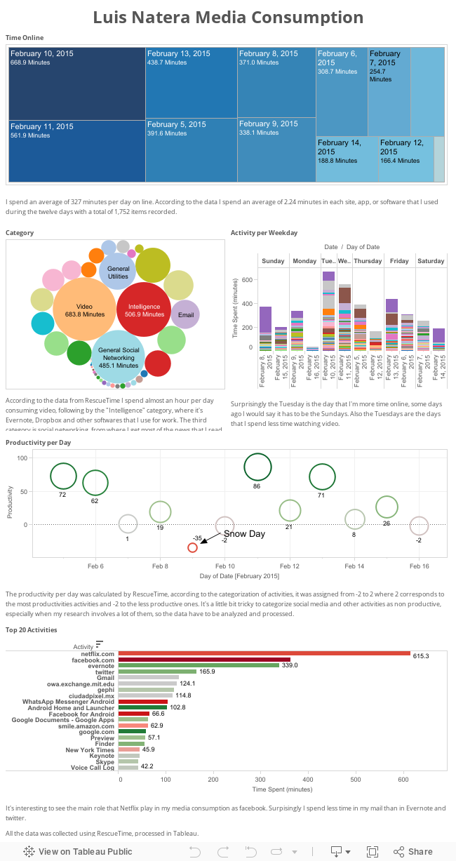
I recorded my media consumption on my computer and cellphone using RescueTime and this is what I get:
My Media Orbit
Hi folks. For the media diary, I made a Prezi, featuring international travel and cold ice skates.
http://prezi.com/y1rhd1f18y-s/?utm_campaign=share&utm_medium=copy
A week in the clickhole
Publishers and advertisers are after our attention, but they can’t decide how to measure it. Clicks still hold sway, but recently there has been a focus on “attention minutes” — which, as far as I can tell, is marketing-speak for “time spent” — as a more nuanced and realistic measurement of a reader’s engagement. Champions of attention minutes claim that it is a win for both advertisers and readers, who will have a better idea of impact and incentives for more engaging content.
I’m skeptical because attention minutes still require a click in the first place, and headlines still battle for attention. I’ve been curious about how clicks and minutes compare to one another. If they match up perfectly, what makes attention minutes any different as a success metric? If they don’t match up, do my attention minutes seem like a better representation of my online engagement for the week?
Process
I started by trying to manually collect data on mundane and repetitive digital events like receiving new notifications, opening blank browser tabs, and absentmindedly checking my phone. These turned out to be really hard to record. I found myself changing my habits, and getting distracted by the act of writing it down. Measurement bias was coupled with measurement fatigue, and I would often forget or not have time to write things down.
I opted for more automated tracking methods. For the week of February 8 to February 14, I tracked my clicks using Chrome’s History, and my time spent online (my attention minutes) using RescueTime. In order to limit measurement bias, I avoided looking closely at the data until the end of the week. I didn’t track my phone use, but I tend to use my phone for emails, texts, and games rather than web activities.
Tracking clicks
Chrome stores the last 3 weeks of its history locally in a SQLite database, which made it easy to retrieve my click data for the week, though it took a little query magic to limit it to the week in question.
I hit 4639 webpages over the course of the week, over 650 pages a day. This consisted of 1847 different websites — meaning I went to a single page 2.5 times on average.
I extracted the top-level domain from each visited URL using the tldextract python library, and found that I’d visited pages at 233 different domains. The breakdown of domains was as follows:

I visited Google more than domains #8-233 combined. The fact that I’m using Chrome’s history and visualizing it on Fusion Tables only drives home the point: for me, half of using the internet = using Google.
But I was also a bit surprised by some of my click data here; five of my top seven most-visited pages were Google pages, and three of them were Google Docs.
| Domain | Title | URL | Hits |
| MW2015 Paper – Google Docs | https://docs.google.com/document/d/1Tr8K… | 291 | |
| https://docs.google.com/document/d/1o-oL… | 155 | ||
| https://www.google.com/webhp?sourceid=chrome-instant&ion=1&espv=2&ie=UTF-8 | 137 | ||
| https://twitter.com/ | 72 | ||
| (2) Facebook | https://www.facebook.com/ | 52 | |
| Inbox (25) – liam.p.andrew@gmail.com – Gmail | https://mail.google.com/mail/u/0/#inbox | 39 | |
| https://docs.google.com/document/d/1bnMq… | 32 | ||
| Liam Andrew (@mailbackwards) | Twitter | https://twitter.com/mailbackwards | 29 | |
| mit | MIT Libraries | http://libraries.mit.edu/ | 20 |
| oclc | Main Menu: ILLiad — MIT Libraries | https://mit.illiad.oclc.org/illiad/illiad.dll | 18 |
I was collaborating on a few projects and papers in Docs this week, but I don’t think I hit these pages hundreds of times. A one-page handout that I prepared for a class was apparently visited 155 times, even though I opened and closed it within an hour. Is Google automatically refreshing these pages, treating them as link visits? This would throw off my results immensely. This also made me think about what counts as a “visit” to Facebook or Twitter. Clicks might work for publishers, but they are less well defined for platforms and applications.
I also noticed a domain simply called “t” that had 40 overall clicks; this turned out to be the “t.co” link-shortening mechanism on Twitter. It was interesting to discover that I’d clicked on 40 Twitter links this week, but I wondered whether it was tracking the final destination too. Does a “visit” include redirects? I’d need to investigate how Chrome stores its history.
Chrome does store detailed metadata about each individual visit (e.g. did you arrive via a link from another page? a bookmark? manually typed into the address box?), so an examination of this data would allow for a glimpse into what Chrome History is storing, as well as offering a deeper dive into my interactions with specific sites. I wonder, for instance, if advertisers should be more interested in sites that users are likely to manually type into an address box, rather than arriving from email or Facebook.
Tracking minutes
I tracked my time for the week using RescueTime. I first threw out any non-internet usage, which turned out to be 47% of my total computing time (primarily Mail, Acrobat, and Evernote). Some of these differences felt arbitrary; I might decide to download a PDF rather than read it on the web, or start a cover letter in Evernote rather than a Google doc, and these decisions would affect hours of my time.
This left me with 31 hours logged online, though it’s safe to say I wasn’t paying attention to my computer this whole time. RescueTime thinks I spent 1 hour browsing “newtab” this week, when in fact I was probably distracted by the real world.
A pie chart felt appropriate as a representation of my attention, with advertisers fighting over slices:

I had to consolidate a number of rows to get data consistent with the click data, but when I did, I found that 7.5 hours — about 25% of my total online time — was on some Google app or another (3:17 on Google Docs). The next three were the New York Times (2:12), Facebook, (1:40), and Twitter (1:14).
The two charts look similar, with some of the same characters and similar breakdowns, but there are a few differences. Attention minutes benefit the New York Times, while Google and MIT fall to a smaller share of the pie. Another interesting data point here is Wired, which only got one click all week, but 55 minutes of my attention (I believe I was lost in some court transcripts in the Dread Pirate Roberts case…a true attention hole). Wired wins out when measuring in this way…possibly more than it should.
My attention minutes look a bit more balanced than my clicks, but it still follows a sort of power-law distribution, with the majority of my time on just a few sites (my top 10 accounted for more than 50% of my total viewing time) and a long tail of sites that I only spent a few seconds on:

I found that the few-seconds sites were the ones I used for quick facts and reference, while I spent more time on sites with full stories and articles. This seems to benefit publishers, but it actually might be a good goal for information and reference sites to reduce time spent on the site.
Combining the two
If we assume that both the click and time data are good and interchangeable (neither of which is necessarily true), then I spend an average of 23.19 seconds on any given website. Publishers like the New York Times and Wired win out when I measure minutes, while libraries and information providers like MIT and Google are more geared towards clicks.
Clicks and minutes both follow power laws, and generally feature similar sites at the top of both. There is a lot of correlation. Time spent may or may not be a slightly more balanced view of my online habits, but it brings its own skews. In the end, the most balanced representation of my week online probably sits somewhere in between these two metrics.
My News Diet On A Quiet Blizzard Day

A couple of tools
I’m unfortunately unable to come in to class today, but I wanted to share a couple of tools I was introduced to this past year that I have found quite useful.
Pear Note ($40, OS X) is an app that integrates keystrokes, audio and video to dramatically improve the note-taking experience. It’s especially useful in interviews: As I record audio, my keystrokes are synced to audio timestamps. That way, I can easily go back and couple my notes with specific times in the interview. It’s also pretty freeing; I can take notes on facial expressions, ambiance, and other things while pegging these descriptions to specific moments in the interview. Check it out at http://www.usefulfruit.com/pearnote/
Skype Call Recorder ($30, OS X) does one thing and one thing only: it records Skype calls. This one-trick pony does its one trick especially well. Check it out at http://www.ecamm.com/mac/callrecorder/
My apologies to PC users for my staying in Apple’s walled garden. For Mac users, though, hope these are useful!
Feb 11 Class
Assignment for February 11 (OPTIONAL): Select a tool that you believe has important implications for the future of news or storytelling. Come prepared to present a quick introduction to using the tool for your classmates.
Location Change: We have more than 40 people who have signed up for the class. We need a bigger room. Hence, we will now schedule our class in the room E15-341; it is by the counter with the sink (near foodcam).
February 11: The New Toolkit
In black and white movies about the golden age of newspapers, the journalist’s toolkit includes a manual typewriter, a press card and a bottle of bourbon. Today’s journalist is often asked to report a story online, lay it out for publication on paper, accompany it with a video feature or an interactive data visualization and promote it via social media. For the first half of the class, Alexis Hope, Ali Hashmi and Jude Mwenda will present some of the tools, introducing you to their capabilities and uses. For the second half of the class, students will show off some of their favorite tools and offer instructions in how to get started using these tools.
Matt’s Data Diary for Feb 5-9
Image

My news diet starts with a newspaper, Boston Globe, every day (except when there’s a big storm, ha!), and is followed by iPhone browsing of news apps on the train, then browsing throughout the day, often triggered by 6-7 newsletters. I often watch local TV news, but almost always just for the weather. btw, this also shows the last time I jogged and roughly how many times I shoveled.
Revised assignment schedule
Please see the revised assignment schedule for MAS 700 in the assignments tab. Please note that Media Diary assignment is now due on Feb. 18.
Media Diary & Four Hour Challenge are mandatory assignments.
Assignment for February 11 (OPTIONAL): Select a tool that you believe has important implications for the future of news or storytelling. Come prepared to present a quick introduction to using the tool for your classmates.
Assignment, due February 18 (REQUIRED): Media Diary
Maintain a media diary, tracking all media you encounter in the course of a week, where it originated, whether it was news or entertainment media. Present your diary, preferably in a way that offers summary and analysis of patterns you’ve discovered from keeping it.
Prior year examples: Adrienne’s Media Diary, Erhardt’s Media Diary, Catherine’s Media Diary, Jean’s Media Diary
(Please see the assignment schedule in the syllabus)