MAS S61: assignment #5

顺德区政府大楼

Last week, we visited Foshan to interview factories for a consulting project that Professor Huang Yasheng is doing for the Guangdong provincial government. One of our first stops in Foshan was to the ginormous Shunde District Government Office, which the locals have dubbed “Shunde White House.” The Communist Party of China has cited Shunde’s government office one of the more extravagant government office buildings. It also got me wondering: Where did the Shunde district government get the money to build the government office building? I checked Shunde district government’s fiscal budget for the past decade and came up with this graph:

Shunde revenues

It looks like Shunde district government’s revenues have been growing because they have been collecting more income tax from the companies in the region. Shunde’s government has benefited from having white goods manufacturer Midea based there. Midea accounts for 70% of the township’s GDP. Last year, Midea paid 5.2 billion RMB ($823.6 million) in taxes or almost 60% of Shunde’s income tax revenues, according to the Beijiao Economy Promotion Bureau.

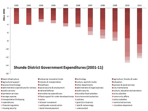
Shunde expenditures

Naturally, I then wondered where the Shunde District Government was spending all of its money (besides building huge government office buildings). Surprisingly, the number one expenditure by the Shunde District Government was in education. Last year, the Shunde district government spent 2.9 billion RMB or 22% of its total expenditures on education.

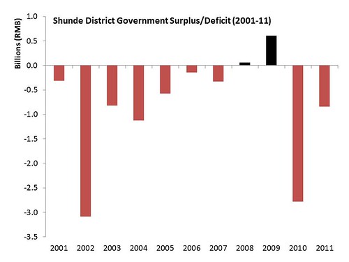
Shunde deficit

When I combined the two graphs of Shunde District Government’s revenues and expenditures, it turns out that Shunde has had a deficit in 8 out of the past 10 years. The only two years when Shunde didn’t report a deficit were in 2008 and 2009, which is a bit ironic since the financial crisis was pushed most other governments further into debt.

A lot of local governments took on debt in 2008 and 2009 to invest in transportation infrastructure projects to get through the financial crisis. The National Audit Office came out with a report in June 2011 estimating that China’s local government held a cumulative 10.7 trillion RMB ($1.7 trillion) in debt at the end of 2010. Some policymakers and academics in China have been starting to get a little concerned because 17.17% of the debt needs to be paid back last year and this year.

The capitalist network the runs that world?

Hey everyone!

So I didn’t do a cool data project, but wanted to see what everyone thought about this one:

http://www.newscientist.com/article/mg21228354.500-revealed–the-capitalist-network-that-runs-the-world.html

It was from last year. How strong is the data and the graph?

The 1318 transnational corporations that form the core of the economy. Superconnected companies are red, very connected companies are yellow. The size of the dot represents revenue (Image: PLoS One)


What James Ibori Stole

For this week’s datajournalism assignment, Godwin Nnanna and I looked into the admitted theft of $250 million of Delta State money by James Ibori, who pled guilty in London in late February. (get the data)

We wanted to find out just what he stole, explain how it fit into the context of corruption more generally in Nigerian states, and clearly illustrate the magnitude of his actions. We’re still working on the article.

Data Collection

To tell this story, we needed information on what Ibori stole as well as more general information about Nigerian government budgets. We had to compile our own datasets from a variety of incomplete sources.

  • The Metropolitan Police Press Bulletin contained detailed information about the guilty plea, including addresses, value amounts, and photographs of Ibori’s highest value assets. This information was the basis of all of the newspaper reports we saw.
  • Values were not provided for some of Ibori’s UK properties, so we used Zoopla’s property database to arrive at reasonable price estimates based on comparable properties in the vicinity
  • We obtained the guilty plea from the writer who covered the issue for the BBC. The prosecutor did not respond to our emails.
  • Nigerian government budget information is very hard to get, and actuals are almost impossible to obtain. We were able to cobble together enough information for the story however:
    • Godwin called contacts at the Nigerian Economic and Financial Crimes Commission
    • I scraped federal and state budget data from YourBudgIt.com, a scrappy government transparency initiative out of Nigeria’s CoCreation Hub. YourBudgIt (who launched a redesigned website today) then sent me updated data after I requested it on Twitter.
    • A number of citizens’ advocacy groups track budgets and expenses of Nigerian states. Many will look through the budget for building projects and then take photos of those projects to monitor if the money is being used.
    • Our datasource is here, which includes inline links to sources where possible

Presentation

We want to use this data to add context to the story– to tell people that focusing on Ibori’s luxury assets actually minimizes our impression of how much he stole. The assets reported by Scotland Yard account for less than half of what he stole.

James Ibori and his associates pled guilty to stealing a lot of money– half as much as the Nigerian federal government spends on agriculture in a year and several times the annual budget for education and health capital projects in Delta State, where he was governor.

Godwin argues that James Ibori is not an exception. He wanted to dig further into how money gets allocated to states in the Niger Delta and what they do with it. So we developed two more visuals. The first shows federal allocations to Nigerian states– showing just how disproportionate federal allocations are to states in the Niger Delta.

Then we created a series of dashboards for the four major delta states, showing a variety of figures about budget allocations, health, education, and poverty. Here for example is Delta State, where inequality is rising rapidly, poverty is widespread, health and education are a small part of the budget, and most of the money goes into capital projects, which sometimes go into people’s pockets rather than the infrastructure they supposedly support.

Partnerships between Techs and Journalists

This was the first time I partnered with a journalist who was unfamiliar with what it takes to write software or do data wrangling. As a result, I think we ended up doing our own thing toward the end, and I expect that we’ll have to put significant work into making our stories converge. Between the growing popularity of data pieces and Initiatives like the Data Journalism Handbook, I hope it will become easier for these collaborations to go smoothly.

Overall, I think it’s important to communicate the stylistic affordances of data journalism as well as the constraints on scope created by committing to collaborate on a data piece. Overall, I would love to learn more about successful working practices of data researchers who collaborate with journalists.

Tech Design & Recommendations

This was a *hard* project to do. Here are some recommendations:

  • We need to encourage and support more NGOs to release data alongside their reports.
  • We need to design databases which are capable of containing information about the source of figures in different rows/columns
  • We need to do more to make journalists aware of data resources in their own area, as well as support NGOs towards sharing more of their data sources with journalists
  • We could crowdsource the creation of datasets from disparate sources if we had the tools for crowd researchers to document the source of a particular number, and tools for users of that dataset to evaluate the sources of those numbers
  • Lots of organisations are independently pressuring government for the same data. A “What Do They Know” app for Nigeria which helped  them pool efforts would be awesome.

Polar bears and climate change vs coal and GDP?

Do people care about polar bears when the economy contracts? Is it easy to worry about climate change if you rely heavily on coal? There’s some circumstantial evidence that the answer to both is “No”.

Worries about climate change have declined worldwide since the 2009 Copenhagen summit failed to come up with a binding deal to fight global warming. But how can policymakers revive public interest, and who needs to be targeted?

In countries where the economy is heavily dependent on coal – emitting most greenhouse gases of the major fossil fuels — people seem to worry less about climate change than those living in nations that are relying more on sources such as gas, nuclear, hydro, solar, or wind power.

Of course the coal-dependent countries shouldn’t be unconcerned, because they have more work to transform their economies. Or is it like the American writer Upton Sinclair (quoted by former U.S. vice President Al Gore) used to joke: “It is difficult to get a man to understand something if his salary depends on his not understanding it.”

Here is a graph showing the rate of people (blue) in various nations who consider climate change a “very serious” problem, topped by Brazil with 85 percent in 2010 and with Poland at the other end on 37 percent — the rates of electricity generated from coal (red) generally rise in an inverse relationship with these worries. Brazil gets 2 percent of its electricity from coal, Poland about 95 percent.

(Source: coal statistics 2005: International Energy Agency report on Energy Efficiency Indicators for Public Electricity Production from Fossil Fuels; “Is Climate Change a serious problem?”, 2010 survey by the  PewResearchCenter

The United States is among the nations most sceptical about climate change, and gets about 50 percent of its electricity from coal — high for a developed nation.

So more education about coal may be a policy goal.

Dozens of environmental activists (some of them in the photo at the top) wore polar bear suits to urge action at U.N. climate talks in Bali, Indonesia, in 2007  — incongruously sweating on the equator as they paraded thousands of miles from the bears’ icy habitat. Since that meeting, environmental groups agree that the number of polar bear suits worn at U.N. negotiations has tumbled: why?

Are people bored of the bears and the theme of climate change in general, after the U.N. summit in Copenhagen in 2009 failed to come up with a treaty? Is it that Arctic summer sea ice reached its lowest extent on record in 2007 and so was most newsworthy that year?

Or is it harder to be concerned about an iconic species – one that very few people will ever see – when the economy is in recession and people have more immediate worries about jobs? Mobilising efforts to “save nature” as an abstract idea may be easier to sell when the economy is strong.

It’s hard to know the answer, but here’s a graph tracking the number of mentions of polar bears (red) in leading U.S.  newspapers year by year against changes in annual U.S. Gross Domestic Product (blue):

(Sources: U.S. official government statistics for GDP; Factiva searches of general news mentions of polar bears in the New York Times, Los Angeles Times, Washington Post, Boston Globe, San Francisco Chronicle)

It looks like the polar bear series roughly follows trends in the blue, GDP series, with a couple of years’ delay. The number of mentions of polar bears rises steadily from 2001 to a peak in 2007-08 and then declines sharply. The U.S. economy grew robustly until about 2006 when growth slowed, it entered a recession in 2008, which deepened in 2009 before a rebound in 2010.

So if there is a link – obviously it’s impossible to say just from a correlation –the message for policy makers is: if you want to push major environmental reforms, do it when the economy is picking up, or has good chances of staying strong for several years. (…of course, that may require a well-functioning crystal ball)


Mathematical Aptitude

[Note: This article is still in progress]

Though there has been a lot of effort to increase the participation of women in STEM (Science, Technology, Engineering, and Math) fields, many claim that these efforts are in vain (or worse, will end up sacrificing excellence) because women simply aren’t as blessed as men when it comes to the required characteristics to succeed in these fields.

Some claim this is due to biological, evolutionary factors, and others acknowledge there is cultural bias involved.  I examined Larry Summers’s infamous speech to the NBER Conference on Diversifying the Science & Engineering Workforce in 2005 [1].  In particular, I examine his overall set of hypotheses, which are that there are three main reasons why there are not more women in high-end STEM positions.  The first is that these jobs are very demanding and require a commitment that those who are responsible for childcare (mostly women) simply cannot make or will not choose to make.  The second is a measured variability of mathematical aptitude, and the third is cultural bias (in terms of socialization and discrimination).

There are three broad hypotheses about the sources of the very substantial disparities that this conference’s papers document and have been documented before with respect to the presence of women in high-end scientific professions. One is what I would call the — I’ll explain each of these in a few moments and comment on how important I think they are — the first is what I call the high-powered job hypothesis. The second is what I would call different availability of aptitude at the high end, and the third is what I would call different socialization and patterns of discrimination in a search. And in my own view, their importance probably ranks in exactly the order that I just described.

I am particularly interested in his second hypothesis, the different availability of aptitude at the high end, what that implies for the gender make up of professors in STEM fields, and whether this is something to be worried about.  Here are Larry Summers’s thoughts:

I looked at the Xie and Shauman paper — looked at the book, rather — looked at the evidence on the sex ratios in the top 5% of twelfth graders. If you look at those — they’re all over the map, depends on which test, whether it’s math, or science, and so forth — but 50% women, one woman for every two men, would be a high-end estimate from their estimates. From that, you can back out a difference in the implied standard deviations that works out to be about 20%. And from that, you can work out the difference out several standard deviations. If you do that calculation — and I have no reason to think that it couldn’t be refined in a hundred ways — you get five to one, at the high end.

The implication is that what we see in STEM fields today is somewhat “natural” because of this difference in variability.  So, are guys really better than girls at math?

There are several studies on mathematical ability as measured by standardized tests and mathematics competition participation in high school.  It’s important to note that there are several problems with drawing a straight line from these findings to the number of women in the upper echelons of STEM fields, namely because even if there is a difference between measured ability, it’s unclear if that difference is the result of biological or cultural factors (studies have shown that if women are reminded of their femininity or traditional gender stereotypes, their performance and desire to pursue math-related fields decreases [2]).  Also, no one has successfully made the connection between performance on these tests and measured effectiveness at these elite, high-powered jobs.  While it seems reasonable that a Computer Science professor at an elite university should be in the top 1% in mathematical ability, 1) It is unclear how important this factor is and 2) It is unclear that this ability as it effects performance in academia is accurately measured by these aptitude tests.

Numerous studies have shown that when considering the average, there is no difference in mathematical ability between girls and boys [4].  However, boys show higher variance in ability, meaning that in the top 1% of achievers, one would expect to see more men.  In the top .01% of achievers, one would expect to see significantly more men.  In his speech, Larry Summers does a back of the envelope calculation to justify a 5:1 ratio of men to women in academia in STEM fields.

I look at a few studies which examine mathematical aptitude by gender at the high end.  An MIT article [3] examines the performance of high school girls and boys on the math portion of the SAT and the AMC, the American Mathematics Contest.  In the following graph, the horizontal axis is the percentile on the exam, and the vertical access is what portion of those students at that percentile were female.

The graph shows that as the percentile increases, the proportion of girls drops.  So it appears true that at the very high end, boys perform better on these tests than girls, which seems to substantiate Larry Summer’s claim.  However, a similar study, by Janet Hyde et al. in Science [4], shows that the results are almost reversed for Asian Americans:

For whites, the ratios of boys: girls scoring above the 95th percentile and 99th percentile are 1.45 and 2.06, respectively, and are similar to predictions from theoretical models. For Asian Americans, ratios are 1.09 and 0.91, respectively. Even at the 99th percentile, the gender ratio favoring males is small for whites and is reversed for Asian Americans.

No one has thoroughly demonstrated the reasons behind this data; in particular, no one has shown that it is due to biological differences instead of cultural differences.  In a separate study, Hyde et al. show that though variance exists, its causes are likely not biological [5]:

Furthermore, data from several studies indicate that greater male variability with respect to mathematics is not ubiquitous. Rather, its presence correlates with several measures of gender inequality. Thus, it is largely an artifact of changeable sociocultural factors, not immutable, innate biological differences between the sexes.

If the discrepancy in performance on these tests is due to cultural differences, one could argue it would greatly benefit our society to encourage talent in these hugely important fields, and cultivate mathematics and science talent wherever it is hiding.

In particular, we should consider the raw numbers of boys and girls who choose to participate in math-related activities, and thus develop the skills necessary to participate in the high end.  The MIT study showed that the number of girls in the top 1% were disproportionately clustered among a few excellent schools, while the number of boys were spread out among different tiers of schools, “suggesting that almost all girls with the ability to reach high math achievement levels are not doing so.

Another study [6,7] looked at the representation of women amongst the top chess players.  An important conclusion is that the small percentage of women can be entirely explained by the fact that fewer women than men engage in chess.  Given that the male grandmaster population is drawn from a much larger potential set of male chess players, one would expect to see higher performers. What it comes down to is a problem of feeding the pipeline.

So though Larry Summers might have correctly identified three reasons for the dearth of women in the upper echelons of STEM fields, he is likely mistaken in his claims on the order and magnitude of significance of these factors.  In addition, his implication that the resulting inequities in higher academia are “fair” and based on merit is simplistic, given that the difference could be an artifact of cultural factors, and likely removable.

[1] http://www.harvard.edu/president/speeches/summers_2005/nber.php

[2] http://pss.sagepub.com/content/18/1/13

[3] The Gender Gap in Secondary School Mathematics at High Achievement Levels: Evidence from the American Mathematics Competitions.  Glenn Ellison (MIT and NBER) and Ashley Swanson (MIT) July 2009

[4]  Hyde, J.S., Lindberg, S.M., Linn, M.C.,      Ellis, A.B. and Williams, C.C.”Gender Similarities Characterize Math Performance”.  Science: http://www.sciencemag.org/content/321/5888/494.full

[5] http://www.pnas.org/content/106/22/8801.short

[6] http://blogs.discovermagazine.com/notrocketscience/2008/12/23/why-are-there-so-few-female-chess-grandmasters/

[7]  http://rspb.royalsocietypublishing.org/content/276/1659/1161

Fact Checking a Technique

Felipe Andres Coronel, better known as Immortal Technique, is a popular underground rapper of Afro-Peruvian whose rap lyrics focus on controversial issues such as class imbalance, racial inequality, institutional oppression. Unfortunately, many people consider many of Immortal Technique’s lyrics as conspiracy theories and the antics of a wild man. In response he lucidly argues that his lyrics are simply “the truth”, and the truth is often seen as revolutionary.

In his own words

I give niggaz the truth, cause they pride is indigent

On March 17, 2012, Immortal Technique will take the stage in Boston’s Paradise Rock Club. As a fan of Mr. Coronel’s lyrical prowress and a budding journalist, I will naturally attend the concert and listen to his thoughts on current issues. I find it valuable to perform a cursory factual assessment of his lyrics. To do this, I picked his verses from the song Young Lords from his most recent album, The Martyr:

Enjoy the song on Grooveshark!

I survived the cointelpro assassinations.
AIDS epidemic, Crack era, fractured a nation,
The Interpretation of American Democracy,
Is best exemplified in it's foreign policy dichotomy,
I live a double life of political philosophy,
But revolution follows me, the struggle for equality,
Against the morally bankrupt claiming to be born again,
It's a civil war again like MS-13s origin
Ban ethnic studies claiming our culture will swallow them,
But you can't conquer people and build a country on top of them,
And then feel offended that they breathe the same oxygen,
Your family values lack the wisdom of Solomon,
But Operation Condor and Operation Bootstrap are Polisci 101,
Research for the new jack,
It's hard to reach Communist Utopia tomorrow,
When your hands are in a fuckin glass jar like Che Guevara,
Forget the distorted historical facts you were given,
Slave trade was the capital for capitalism,
Trapped in a prison mentally, dying existentially,
Separated from people you can't see yourself to be,
Then racially integrated into a burning house colony of an empire,
Economically burning out,
Can't win a debate so they sponsor every threat to me,
I wonder if agent 800 is standing next to me!    

Let’s go through the first half.

COINTEL assassinations: COINTELPRO were a series of declassified, covert and illegal projects to remove power from domestic policital organizations, such as the KKK and Black Panthers. The summary report by the Senate acknowledges that “… the domestic activities of the intelligence community at times violated specific statutory prohibitions and infringed the constitutional rights of American citizens.” However, the projects were active between 1956 to 1971, and are unlikely to have directly affected Felipe (born 1978).

The Interpretation of American Democracy / Is best exemplified in it’s foreign policy dichotomy: The US government’s foreign policy has often been called a dichotomy – for example, when the government calls to reduce weapons in the Middle East while supplying tanks to countries in the Gulf. Similarly, while the United States is called the “greatest democracy on the planet”, controversies such as the financial institutions’ ties with the Federal Reserve, and the 1%.

Civil war like MS-13s origin: MS-13 is an L.A.-Mexican gang notorious for their excessive cruelty. It originated as a group to protect Salvadoran immigrants, fleeing civil war in their home country, from existing, well establish Mexican gangs in the area, despite both sides being immigant populations living in the same region. Stepping back, we can see that much of the news in the past several months have focused on income disparities and the resulting unrest. Comparing current events to a civil war between a militant government and a guerrilla coalition is certainly an overstatement.

Based on an admittedly small sample set, the relationships that Technique weaves between (factually accurate) historical events to current events and himself are tenuous at best. This is an instance where the individual facts are correct but the contextual information is “pants on fire”.

To perform the fact checking I used a combination of RapGenious (not a very good source), Wikipedia, and old fashioned Google searches.

Has global warming stopped? Sceptics’ many distortions; at least one U.N. exaggeration

 “No Need to Panic About Global Warming“, was the headline over an opinion article in the Wall Street Journal by 16 scientists who dismiss fears of widespread damage from climate change.

Many mainstream experts, looking at data like the graph above showing a long-term warming trend, have rejected the Jan. 26 article as a mish-mash of wishful thinking and exaggerations by scientists who are not in touch with the numbers. Others, like Republican Presidential hopeful Rick Santorum, have a more extreme view of “truth” and dismiss global warming as a “hoax”.

So where do well-informed scientists who doubt global warming is happening get their data from? This is an attempt to find out.

Wall Street Journal: “Perhaps the most inconvenient fact is the lack of global warming for well over 10 years now.”

According to the World Meteorological Organization (WMO), the 13 warmest years since records began in the mid-19th century have all occurred in the 15 years since 1997 – making it hard to conclude that warming has stopped. The warmest years were 2010, 2005 and 1998.

The assertion in the WSJ seems to be based on the observation that 1998 was the warmest year and so global warming has stopped. But the logic does not really hold up: temperatures of 1998 were driven up by natural variations — an exceptionally strong El Nino event in the Pacific that can nudge up temperatures worldwide and is a far bigger effect than the year-to-year buildup of greenhouse gases. And mainstream climate scientists say it is unreasonable to assume that temperatures will rise steadily year by year.

Here is one WMO graph of temperatures — sceptics look at the spike in 1998 and say it’s stopped since then. Mainstream scientists look at the longer term upwards trend over decades.

VERDICT ON WSJ STATEMENT: UNTRUE

But there are exaggerations in the mainstream too.

“Our science is solid and it proves unequivocally that the world is warming and that this warming is due to human activities,” Michel Jarraud, Secretary-General of the WMO, said in a written statement about temperatures in 2011.

But his assertion that science proves that warming is due to human activities goes well beyond the findings by the main U.N. authority, the Intergovernmental Panel on Climate Change (IPCC), in its last report in 2007.

That says that: “Warming of the climate system is unequivocal” (i.e. the world is getting warmer but it might be due to natural variations). It separately says it is at least 90 percent likely that human activities are “the main cause of warming in the past 50 years.” So there’s a small chance that natural variations – solar activity, etc – might be causing most recent warming, i.e. there is no proof.

Wall Street Journal: “Although the number of publicly dissenting scientists is growing, many young scientists furtively say that while they also have serious doubts about the global-warming message, they are afraid to speak up for fear of not being promoted—or worse.”

VERDICT – NO EVIDENCE, VERY PROBABLY UNTRUE

The article gives no numbers for “dissent” and many mainstream scientists say it is absurd to suggest that there is a conspiracy to cover over a lack of evidence for global warming. Richard Alley, an IPCC author at the University of Pennsylvania, notes that Einstein became famous for exposing shortcomings in Newton’s theory of gravity: i.e. it is every scientist’s dream to show where well-established theories are wrong.

Wall Street Journal article: “Even if one accepts the inflated climate forecasts of the IPCC, aggressive greenhouse-gas control policies are not justified economically. A recent study of a wide variety of policy options by Yale economist William Nordhaus showed that nearly the highest benefit-to-cost ratio is achieved for a policy that allows 50 more years of economic growth unimpeded by greenhouse gas controls.

Nordhaus told Andrew Revkin’s Dot Earth blog in the New York Times:

“The piece completely misrepresented my work. My work has long taken the view that policies to slow global warming would have net economic benefits, in the trillion of dollars of present value. And the IPCC said that the cost of limiting global warming in the most aggressive scenario it considered, would brake world GDP by less than 3 percent by 2030.

VERDICT – UNTRUE

What’s politics or science? There is a clear Republican-Democrat divide about what is true or false.

“We have seen the politicization of science like we have never seen it before…We saw it with global warming…I for one never bought the hoax,” – Republican Presidential candidate Rick Santorum, February 2012

 “Climate change poses a grave and growing danger to our people…This is not fiction, it is science.  Unchecked, climate change will pose unacceptable risks to our security, our economies, and our planet,” President Barack Obama, Copenhagen summit, 2009.


Does Sweetened Beverage Consumption Cause Heart Attacks?

For this week’s assignment we had to fact check a statement in the media. I am particularly interested in how science is reported. I decided to search for a health article. One of the latest findings presented in the news has to do with a study that relates the consumption of sweetened beverages with the risk of hear attacks.

The article that caught my attention is What not to eat: Cut out sugary sodas and red meat & reduce heart disease, new studies say. the article emphasizes how bad beverages such as sodas are and refers to the research study finding by stating that “A 12-ounce sugar-sweetened beverage each day increases a man’s risk of heart disease by 20 percent”.

I am always interested to know how researchers would conclude such a specific statement so I tried to check this in the original article. Fortunately, the publication is cited in the article, so that is easy to find. We are pointed to the abstract of the research publication. Although the abstract summarizes the results, the closest statement to the one we are fact checking is: “Participants in the top quartile of sugar-sweetened beverage intake had a 20% higher relative risk of CHD (myocardial infarction) than those in the bottom quartile”. This is not enough to draw the conclusion that one beverage per day increases heart disease risk by 20%, since we don’t know what the top and bottom quartile mean. At this point I decided to check the content of the paper. Again, we are fortunate that the research paper is available for free. The paper states that the lower quartile of people consuming represents people who never consumed sugar sweetened beverages and the top quartile represents people who consumed sugar sweetened beverages 3.7 to 9 times a week with a median of 6.5. This gives us a confirmation of the amount of sugar-sweetened amount of drinks in the statement. However, the most important fact is that never in the paper is causation mentioned, and never is it stated that consumption of sugar-sweetened drinks leads to an increase in heart attacks. The study merely presents a correlation, and it should be clear that correlation does not imply causation. That is nto the case of how the news article presents the results though. A correlation between the amount of sugar-sweetened drinks consumed and heart disease does not mean that consuming these drinks will lead to a higher number of hear attacks.

Furthermore, while skimming through the research article other limitations come up: “We found no evidence to suggest that overall consumption of artificially sweetened beverages was associated with CHD risk or changes in biomarkers, however non-carbonated artificially sweetened beverages were associated with increased risk in an analysis of continuous intake”. This can be a serious limitation of whether artificially-sweetened drinks also increase the risk of hear disease, which is what the study claims.

Other statements in the study are: “Our study has some limitations. First, dietary intakes were measured with some error.
Second, participants in our study may be dissimilar to those living in the general population. For example, intake of sugar-sweetened beverages was much lower in our study (mean = 0.36 servings / day) than in US adults (mean > 1 serving / day).”. These are all limitations that should affect how we think about this study and what its limitations are. These might not make it to the article presented in the news, especially once we try to reduce the study to a couple of lines.

On addition, is it our duty to also look for similar articles that report relations between consumption of sugar-sweetened drinks and hear disease increase? Is the study presented in the article one of many studies on this issue? Does it have findings already suspected by other studies, how is it different and why should we pay attention to this particular study? These are questions that are not approached in the news report and that might affect how we perceive the study. Should this kind of information also go into fact checking? And exactly where should fact checking stop?

Populist Political Rhetoric & Actual Policy

Jawaharlal Nehru National Urban Renewal Mission is a flagship city redevelopment program that was launched by the Government of India in 2006. The Mission is the largest initiative of Government of India for planned development of Indian cities.

Prime Minister Dr. Manmohan Singh had highlighted on the need to increase quality of life in India cities while launching the program “As we build infrastructure we must also improve the quality of living for all those who live in our cities. Our vision of urban development has so far been uni-dimensional. This must change. We have thus far focused more on space and less on people. We need to have an integrated framework, in which spatial development of cities goes hand-in-hand with improvement in the quality of living of ordinary people living there. ”. Kamal Nath , the new Union Cabinet Minister of Urban Development also recently highlighted that the JNNURM Program is focused on  improving the quality of life in our cities.

To corroborate the government’s assertions that the program is intended to increase the quality of life for most of the people in Indian cities, I analysed the program’s investments in the transport sector that intimately affects the quality of life of ­­­the community.

The total number of projects in the transport sector approved by the Government of India and related spending illustrates a focus on flyover & road related projects that aids car users.

Source: JNNURM

Source: JNNURM


Mapping the above  investments alongside current “modes of transport” in Indian Cities shows that even though car users are a minority in Indian Cities, they are arguably the biggest beneficiaries under the JNNURM Program.

Source: Traffic & Transportation Policies and Strategies in Urban Areas in India, Ministry of Urban Development, Government of India, New Delhi

Principles of urban planning based on dense, walkable, mass transit driven development are critical in ensuring a livable & inclusive city. Experts like Urbanist Enrique Penalosa have often argued that    ” In developing-world cities, most of people don’t have cars, so when you construct a good sidewalk, you are constructing equality. A sidewalk is a symbol of equality” .

The Indian Government’s declarations that JNNURM is aimed at increasing the quality of life for most of its people seems like a populist rhetoric given that their actual  investments show a penchant to serving elite needs.