The focus of my project is on how we can use references to citizen journalism producers in foreign countries to find a community that is discussing about the same things. You can find the slides from last week here. Global Voices is a community of international participants in creating news through blog posts about what is happening in their countries or local communities. Most articles cite sources local to the countries that they are focusing on. We intend to make use of references, such as twitter accounts to identify a broader community that is likely to talk about the same things.
This project is in close relation to the Data Forager. We currently can use a list of twitter accounts to generate the community of people who are followed by them. To exemplify this, we used the Data Forager examples. We build the community that is followed by a set of twitter accounts and use Gephi to visualize the network generated by a basic list of 10 twitter accounts cited in an article. We are able to generate the graph structure from any input that lists twitter accounts. Possible next steps:
output the twitter stream of the community generated from an input list of twitter accounts
identify some metrics to decide what is a better set of twitter accounts that identify the community representative for the discussion in a countries featured in Global Voices. Try to identify from the network structure if the cited accounts are part of different communities.
build a network of all twitter accounts that are cited in Global Voices in each country. Use this to see if the accounts that are cited in different articles belong to different communities.
analyze the structure of the network up to 2 nodes distance from the original list of twitter accounts
AIM –Providing relevant background info on Corporations via linkages to existing records
(Godwin & Evelyn)
A good understanding of the entities they cover enable journalists to write better stories about subjects when they report them. Unfortunately for most business journalists in the developing countries, their knowledge of the multinational corporations that operate in their countries often do not go beyond the information put at their door steps by the PR machineries of these companies. Knowing where to go for key information about such corporations could be challenging for many local journalists.
Yet the influence of these multinationals (good and/or bad) on their economies are huge. In Africa, for instance, they dominate leading sectors like oil and gas, mining, banking, telecommunications, and construction. As a result they are often the contractors for most big public and private sector contracts in the continent.
Our project involves the creation of a browser tool that will help local journalists in different countries mine data about multinational corporations operating in their regions from relevant institutions/government agencies in their countries of operation as well as home countries via existing websites. Such agencies as SEC, company registration authorities, central bank, prosecution authorities, watchdog groups, custom and tax authorities, stock exchanges, etc.
Often when you use search engines to look up companies, they do not provide linkages to such critical institutional data. The essence of this project is to quicken cross-border access to information about companies operating offshore in a way that gives journalists insights on the corporations operating in their shores.
The strategy would be to identify on country by country basis (starting with West Africa), multinational corporations working in each country. For the purpose of the class project, we intend to take one (or at most two) each of multinational companies that operate/have operated in Nigeria and Ghana – (Halliburton, Siemens and Mabey & Johnson, Tullow) as pilots.
I’m interested in nutrition, and health in general. As a result, I’ve read a lot of really shoddy nutrition and health news over the years. I’ve noticed that the mistakes journalists make usually involve coverage of a single scientific study. For example, correlation is presented as causation, making us all a little dumber. You can see for yourself over at Google News’s Health section, where you can see a variety of takes on the same study results. A study on the mental benefits of expressing one’s feelings inevitably produces the clickbait headline, in one source, that Twitter is better than sex.
What if readers and journalists had a semi-automated grading rubric they could apply to media coverage of medical studies and drug development?
I started looking around, and found that science journalists are concerned with these problems. Veterans like Fiona Fox at the Science Media Centre have even shared some specific red flags for the skeptical observer. I was also fortunate enough to meet with two of our classmates (who also happen to be Knight Science Fellows), Alister Doyle and Helen Shariatmadari, who, in addition to significant personal experience, pointed me to great additional resources:
I’ll also be meeting with science writer Hannah Krakauer tomorrow.
I’m pulling out as many “rules” (in the software sense) as I can from these recommendations, and will then attempt to build a semi-automated grading rubric for these types of articles. It’s important to note that there will still be user involvement in producing the score.
(click image to expand)
I hope to present the results in the spirit of HubSpot‘s Grader.com series of tools for grading website marketing, books, and Twitter authority. The tools themselves vary in utility, but the format of the results embeds an educational layer into the score review (unlike closed-algorithm services like Klout). I am more interested in training journalists and readers to develop a keen eye for the hallmarks of high- or low-quality science reporting than the actual numerical score on a given article. By asking for readers’ involvement in scoring an article, I might be able to augment the automatic grading with human input, but also help teach critical thinking skills.
Down the road, it’d be interesting to incorporate other journalism tools. rbutr integration could allow us to pull from and contribute to crowdsourced rebuttals of misinformation, while Churnalism would let us scan the articles for unhealthy amounts of press release.
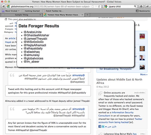
Last week I shared the idea of DataForager, a browser-based tool to support question-centric research and sharing online (DataForager slides here). This week, I built my first prototype.
The prototype of Data Forager detects twitter handles within a web page. Since WordPress mangles links you will have to find it here. If you drag the DataForager link to your bookmarks bar, you can activate it on any page, such as this article on Global Voices.
At present, DataForager doesn’t work on al Jazeera’s embedded Storify stories due to Cross Site Scripting security stipulations in browsers. A future version of DataForager will use JQuery to fetch the iframe data for parsing, without crossing security restrictions.
Next Steps
Now that I am successfully collecting Twitter accounts, my next step is to automatically create or extend a twitter list from this data. I had hoped that it would be possible to use third-party software for this, but I can’t find any third-party software that creates a Twitter list from a set of Twitter accounts. So I’ll have to integrate something into Data Forager itself.
Once DataForager is able to save to a Twitter list, it will be ready for use in reporting stories.
For the final class project, I want to do something with the data collected from the University of Hong Kong Journalism and Media Studies Centre’sWeiboScope Search project. In class last week, Ethan Zuckerman suggested that one option may be to do an online art piece using the most censored Chinese words on Sina Weibo. Out of curiosity, I did a draft of the 100 most censored Chinese words on Sina Weibo to see what came up. Here’s a quick translation of the most censored Chinese words:
转发微博
retweet weibo (simplified Chinese)
转
retweet
转发
retweet
轉發微博
retweet weibo (traditional Chinese)
哈哈
ha ha
偷笑
smile
嘻嘻
hee hee
呵呵
he he
哈
ha
哈哈哈
ha ha ha
蜡烛
candle
怒
anger
吃惊
surprise
泪
tears
围观
crowd
话筒
microphone
思考
think
赞
praise
威武
mighty
求证
confirm
衰
decline
挖鼻屎
pick boogers
The most common words are the Chinese equivalent of “retweet” or “RT.” The next most common are expressions, such as “ha ha” or “anger.” It doesn’t make much sense that the 50 cent party are simply censoring emotions. I’ll need to figure out a way to come up with a way to dig one layer deeper.
Challenge: can I convince the class that a soundtrack might enhance their future journalism?
My Approach
In our last class I was really impressed with how you all approach problems, interrogate ideas and map out paths to a solution so clearly. I’m not a linear thinker. Here’s the proof – my plans for my year at MIT, scrawled back in August last year:
But inspired by the systems thinkers – I’ve tried to be more linear. And if anyone has suggestions for a clearer path, do please get in touch:
PATH 1 – WEEK 1
Talk to a couple of DJs I met last semester who live-mix sound effects into tunes. Ask about sound apps/software, ideas, examples etc.
Choose an already written news story that I can imagine a sound track to.
Find free sound effect archives or sound sharing sites.
Work out how to scrape sound from internet sites (Sound Cloud, You Tube etc).
Work out how to edit this sound to fit the story.
Work out how to most elegantly embed the sound on the story page (using Sound Cloud).
Try it out on someone for feedback.
Assess the workflow for improvements and questions.
PATH 2 – WEEK 2
Write a story myself. (I’m currently writing about suicide, a serious subject that might not seem ideal material for a soundtrack, but because of that, I feel it actually offers an interesting challenge to the sound track idea.)
Gather sound effects with microphone myself (try various microphones – cheap dictaphone, pro mic and smartphone)
Edit sound track.
Upload sound to story.
Try it out on someone for feedback.
Assess workflow.
PATH 3 (concurrent)
Try all the above, but not on news, on something more creative.
Questions I’m asking myself:
What kind of stories would really benefit from sound?
How would a soundtrack change the kind of stories I might want to report on and how I write them?
How complicated are the tools I’m using, how could they be simplified?
Journalists covering global issues often fail to make the complex statistics in their stories comprehensible to readers—whether it’s debt levels, food consumption, cellphones, cancer rates, car or pet ownership or greenhouse gas emissions.
Many reporters are under deadline. Few will take the extra time to make their own calculations or try to research useful comparisons on Google. But, in a world with more than 7 billion people against just 1.5 billion a century ago, the human context is ever more vital.
Too often we just get a giant number – the U.S. debt is $15 trillion, Chinese greenhouse gases are the highest in the world at 7 billion tonnes a year, Americans spend $8 billion a year on cosmetics, etc. Is there some way of helping to put these statistics – huge to the point of meaningless — into an understandable, human framework?
And so, welcome to Globalmetrics.com: a fun, informative and easy-to-use online tool that provides instantaneous context for what global statistics mean per person and a site that offers provocative comparisons for any unfathomable number.
If it’s an economics story, what does your share of debts or GDP represent? A new car? A house? How many vacations? How many pizzas? How would it be, for instance, if everyone had the debts of the average Greek citizen? (awful, in most countries). How would global warming be if everyone emitted greenhouse gases at the rate of an Indian? (much better). The U.S. debt works out at about $50,000 a person – what can you buy with that?
The site probably would be an evolving one, like Wikipedia, and would be similarly curated by its users. Its reliability and credibility would improve over time. Like simple online currency converters, it would offer windows for reporters to input their numbers, select from a logical variety of metrics (energy, monetary, climate, health, etc.) and then the site would mine user-harvested databases and perform simple mathematical conversions based on population and other metrics. All the databases would require cited links.
APPLE AND ORANGES: SOME CROSS-DISCIPLINE CONVERSIONS
Money metrics:
Journalists would have access to credible conversions that help compare boggling numbers to something more tangible. Example: the latest U.S. defense budget of $660 billion. Type in “$660,000,000,000” hit the conversion to “National GDPs” = 7.1 Iraqi annual GDPs.
Death Tolls:
The human cost of remote wars should be expressed in amounts nearer to home to underscore the suffering. Example: the death toll of the conflict in the Democratic Republic of Congo. Type in “5,400,000” hit the conversion to “City Populations” = 2 Chicagos
Surface Area:
Journalists also need to express meaningful units of area in stories. The “Rhode Island Factor” honors the smallest U.S. state, already often used by journalists to connote units of surface area. Example: the area of the Earth’s surface that would need to be covered with solar panels in order to meet global energy needs is, by one estimate, 191,817 square miles.
Type in “191,817” hit the Rhode Island Factor button = 124 Rhode Islands (Conversions would also generate automatic comparisons to the surface area of the closest U.S. state or foreign state. In this example, it would be 1.2 Californias, which would be rather hard on the marijuana industry.)
Ice area:
A nod to climate change stories. Journalists almost always compare the size of giant icebergs calving off Antarctica or Greenland to the area of Manhattan in New York, or 23 square miles. This measurement will be the Manhattan Unit. Example: an 350 square mile iceberg was detected in the Arctic in February. Type in 350 square miles, hit the Manhattan Unit button = 15.2 Manhattans. (The iceberg that sank the Titanic, by contrast, was only estimated at 0.07 miles square = 0.003 Manhattan Units, or roughly the area of the Empire State Building’s footprint.)
SOME MORE PLAYFUL CONVERSIONS:
Variation from the Friedman Means
Famous New York Times columnist Thomas Friedman – in “The World is Flat: A brief history of the 21st century” – proposes that globalization increasingly means a level playing field of opportunities for all nations.
The Friedman factor measures whether he is right or if trade barriers; lack of access to public services such as education and healthcare; messy democracy vs. authoritarianism, etc., mean that the real world is still very much a corrugated place. The variables are under consideration, but could be the some additive function of variables such as the UN’s Human Development Index and some metric of trade tariffs. (The US anything but “flat” when it comes to tariffs of African textiles and other products, for example.) The greater the number, the higher the chasm wall from Freidman’s totally hypothetically flat value of zero.
Safari Units
“Unidades economicas del safari de su majestad el rey (UESMRs)
A measure used in debates between monarchists and republicans about whether royal families are in touch with their people. Spanish King Juan Carlos apologized in April 2012 after a safari to Botswana. This was seen as out of touch in Spain, where the unemployment rate is 24 percent.
So the unit is the cost of a monarch’s vacation compared to state support to people out of work. Rann Safaris lists the cost of its 2-week elephant hunting safaris at $59,500…equivalent to the unemployment benefits for more than 80 people in Spain. The yardstick can be applied to the rulers elsewhere. “Japanese Emperor Akihito had a modest vacation in the south of Japan that cost just 30 Safari Units, his lowest in a decade”. “Prince Charles’ holiday in the Seychelles was a record 120 Safari units.”
AYNS – a measure of corporate friendliness (named after Ayn Rand)
Is your government going too far in being friendly to businesses with tax breaks, etc.? The Ayn Unit helps you find out. The unit divides the pay of the chief executives of Fortune 500 companies – most of them global in reach – by the annual income per ordinary worker in the country you are researching. This figure is then multiplied by the mean corporate tax rate of the country involved.
In America, for instance, the average pay for a Fortune 500 CEO was $12 million in 2011, or 380 times that of the average worker (up from 42 times in 1980). So take 380 and multiply by the U.S. corporate tax rate, of 14 percent. That gives 5,320 Ayns.
The Obama Gap – foreigners’ views of your leader.
Foreigners’ opinions of your leader can help understand how they are doing on the wider stage: this is measured by the Obama Gap. President Barack Obama’s popularity abroad is higher than at home, Kim Jong-un is lionized by the official media in North Korea but denounced as a tyrant abroad. In the Internet age, such a measure can help you connect to the wider world.
Obama after a dinner in Washington, May 2012
For instance, 75 percent of people in European Union nations approved of Obama’s handling of international policies in a Transatlantic Trends survey late last year. Obama’s domestic approval ratings were about 47 percent at the time – so the Obama Gap is +28 percentage points. Few other leaders get polled abroad – proxies could be the number of negative or positive references in the media. “Hollande triumphs” about the French presidential race would be a positive point, “Dictator Kim” a negative.
Inhofe Units/Bodman units (name/metrics under planning)
Sceptics often dismiss the science behind climate change. How costly is this in terms of eventual ice melt, sea level rise? Former U.S. President George W. Bush’s Energy Secretary Sam Bodman once said: “We are a small contributor when you look at the rest of the world…It’s really got to be a global discussion.” But that line – frequently repeated by government officials around the world about their country’s share of responsibility – is a recipe for inaction. The United States is responsible for one-quarter of the world’s emissions of carbon dioxide, recently overtaken by China. Senator James Inhofe is also well known for dismissing global warming as a “hoax”.
The Coke Index
Measuring the cost of something cheap, worldwide: the distortions of taxes, wage costs, transport, storage space, etc. Coca Cola ran an advertisement in 1971 saying: “I’d like to buy the world a Coke”.
So what would it cost if you could really go to your local supermarket and buy 7 billion bottles? Prices vary a lot from country to country and the index would hint at these distortions. We could also divide Coke units by per capita GDP in each country to give a hint of inequities in wealth worldwide judged by access to a single commodity, or maybe link the index to obesity rates. (…This would be a bit like The Economist’s Big Mac index that tracks a basket of commodities, but with a simpler product, covering more countries)
Jolies
(With apologies to Ethan.) A unit of development aid as measured in the differential caused by celebrity involvement. The base line would be Congo ($11 per capita with no Angelina involvement vs. Darfur $300 per capita with Angelina involvement. This is a real statistic. http://articles.chicagotribune.com/2007-12-17/news/0712170080_1_darfur-congo-human-rights
Kilo-gorillas
The amount of funding provided with World Wildlife Fund to protect the rare mountain gorilla in Africa as a factor of food aid to a specific humanitarian disaster. (“The measly famine relief effort in Niger equaled two Kilo-gorillas.”)
Valdez Unit
A metric of oil production. “The total amount of oil burned by the allies in World War I was one Valdez Unit, or 500,000 barrels.” (This is a nominally accurate stat.)
The Warhol Shrug
The artist Andy Warhol said in 1968 that “In the future, everyone will be world-famous for 15 minutes.” Even with social media amplifying your chances, the problem is that there are too many people and not enough time, so the “Warhol Shrug” is for those who simply don’t care about missing out on celebrity.
If everyone were famous for a separate 15 minutes, there would be about 35,000 each year. And with an average life expectancy of about 68 years, there are only 2.4 million slots of fame available in the average lifetime — on a planet with 7 billion people. For Warhol to be right, almost 3,000 people we’ve never heard of will have to become world famous every 15 minutes — that’s obviously impossible. A “Warhol Shrug” is a synonym for “I’m happy to be among the anonymous 3,000.”
CONCLUSIONS
The possibilities are almost endless. A broad database would draw on sources such as the U.N. Population Fund, the World Bank, the U.N. Food and Agriculture Organization, U.N. Framework Convention on Climate Change, U.N. Development Program, International Energy, World Health Organization and pretty much every organization that tracks global numbers. It would also be linked to national statistics, etc.
In many cases, context is just dividing a total number by population. We often hear that China has overtaken the United States as the biggest emitter of greenhouse gases, and that India is catching up fast. But the per capita numbers are often overlooked – Americans are still emitting about 3-4 times more each than the average Chinese citizen. And emissions per Indian are tiny.
So maybe you could type in “China” and “greenhouse gases” and the site would generate total and per capita emissions for other countries, and trends over recent years. It would allow you to see what the average emissions per capita in China mean – the equivalent of driving a typical Chinese car x miles, or the same as flying from Beijing to San Francisco and back x times, etc. It might come up with suggestions about buying carbon credits to cut back on your emissions.
Or it might produce leaders of each country by their countries’ per capita greenhouse gases, something like:
Or data from the U.N.’s Food and Agriculture Organization shows that production of cows, pigs and chickens has surged since the 1960s.
That’s interesting but if you take the data that include population growth, it turns out that beef consumption has fallen from a peak in the 1970s. That’s because the human population has grown faster than the cow population. And that’s probably a more interesting angle to the story.
1960s cow consumption per capita:
MId-1970s cow consumption per capita:
Current beef consumption per capita:
Meanwhile, chicken consumption per capita looks like this since the 1960s:
As an illustration of the difficulties of visualizing money, the following web page is the Norwegian central bank’s overview of a gigantic state pension fund set up to save money from North Sea oil revenues, which are invested in foreign stocks and bonds:
It just gives a constantly updated running total, i.e. 3.44 trillion crowns (almost $600 billion), in the top right. But it’s more interesting — especially if you are Norwegian — to know that it works out at about $120,000 for each of the country’s 4.9 million citizens.
And what is that in terms you can understand? The website, or even a separate app (maybe sponsored by companies wanting to promote their products) could throw constantly updated per capita comparisons like: a $120,000 cabin in the mountains? 40 summer vacations to the Mediterranean? 20,000 expensive Norwegian beers? And what’s $600 billion in other terms? Almost a U.S. defence budget, Switzerland’s GDP?