Should I demand more from my daily horoscope?

Most mornings, I do the puzzles in the Boston Globe‘s g section. These happen to share a page with the horoscopes, which I like to read aloud to anyone within earshot. However, over time, I grew suspicious. The same predictions, even the same turns of phrase, seemed to pop up again week after week. Someone always needed to keep a careful eye on their assets. Love was always “on the rise” for one person or another.

I wanted to find out if I’m simply being sensitive, or if there really was meaningful repetition in the predictions.

THE DATA: http://www.uclick.com/client/bos/el/

The first drawback to starting with a question rather than a data set: I assumed that the online archive of horoscopes would be more robust. Unfortunately, I discovered that only the last two weeks (i.e., March 7 – 19) are accessible. I decided to go forward with my smaller set anyway — because I was still curious, and because two weeks seemed sufficient to at least explore my repetition hunch.

I wrote a small scraper to pull down all of the existing ‘scopes. (Shout-out to Harvard’s CS171 Visualization course and to the pattern.web Python module.) The data was then split two ways: by text alone, and by Zodiac sign.

If I wanted to do this more rigorously, I would need to a good algorithm to suss out all possible repeating phrases. As it stands, I wrote a quick and dirty program to sort the text by individual words, sentences, and phrase pairs.

The most common phrases were…
love is on the rise 7
love is highlighted 5
deception is apparent 4
romance is in the stars 3
love and romance are on the rise 2
love and romance are highlighted 2
love is in the stars 2
love and romance are in the stars 2

Then, using Many Eyes, I ran my text through a few different word visualizations. Many Eyes is an IBM site that allows novice data journalists to play with information in a fairly easy way.

Overall, it helped a lot that I knew exactly what I was looking for when I started this assignment. (Does a data story start with the data? Or with what you want out of the data?) However, I feel more like I excavated some fun facts than an actual “story.”

Regardless, I really want to scrape a whole year of horoscopes now.

Boston Restaurants: Perception vs. Reality

By Rochelle Sharpe and David Larochelle

Yely’s Coffee Shop in Jamaica Plain gets rave reviews for its authentic Dominican food.

“Best Latin take-out food in the area,” one Yelp writer gushed, urging people to “come here if you want yummy pork or juicy rotisserie chicken.” Others described the meals as “incredibly delicious” and high-quality,” with one fan declaring: “I will go far, far out of my way for a plate of Yely’s rice with chicharones. . . Nowhere else measures up.”

But for Boston’s health inspectors, the restaurant has a more dubious distinction. Yely’s has had its business permit suspended more often for food safety violations than any other restaurant in the city during the past six years, with inspectors complaining of food preparers not washing their hands after coughing into them and dead mice decaying in traps on the kitchen floor.

Yely’s lost its license five times since 2007, edging out My Thai Café Vegetarian & Bubble Tea Bistro in Chinatown, which had its license suspended four times and Navarette Restaurant, a barbeque place in Dorcester, which lost its license three times. None of the other 254 restaurants that had their licenses temporarily suspended in Boston were shut down more than twice, according to city health inspection records.

Year after year, health inspectors found similar problems at Yely’s. In 2008, the first time the restaurant lost its license, inspectors complained about substandard equipment and widespread sanitation problems. “No hot water throughout,” the 2008 report said. “Owner is working on hand sink in basement.”

Workers were using wooden sticks to stir food, inspectors said, and thermometers to detect improper food temperatures were broken or missing. Standing water covered the floor, where there were broken tiles and sheets of cardboard being used as mats. “Food handler cough into hands and not wash hands or change gloves,” one inspector wrote, urging the restaurant owner to get safety training for all employees.

But the 2012 report found similar issues. Inspectors found shelves in the food cooler covered in rust and grime. “Observed employee serve food, handle money, answer phone, without stopping to wash hands,” the report said. As for mice problems, it said: “remove dead mice observed attached to four different traps in storage room in basement. . .Rodent droppings observed on floor of storage room in basement, on floor of walk-in cooler, on floor around hand sink . . .on counter tops, shelves, and various other locations.”

At My Thai Café and Navarette Restaurant, meanwhile, inspectors found a variety of sanitation and cooking problems. The city cited the Thai restaurant for improper refrigeration, leaving soiled dishes in sink overnight, and workers smoking and leaving cigarette ashes in the kitchen sink. At Navarette, they discovered pork and beef that were only half way cooked and dangers of food cross contamination because workers were storing raw fish and pork above cut ham and cheese.

Overall, restaurants in Chinatown were shut down most often, with 14 restaurants in the tiny section of town having their licenses suspended during the past six years.

Partisanship in Congress and Time on Bench

DW-Nominate is a way to measure partisan behavior in Congress. I was interested in whether the current state of polarization is different from past eras, so I built two scatterplots showing the history of both houses of Congress:

Partisanship in the Senate.

Partisanship in the House.

Also, I was curious if Supreme Court justices are being appointed younger or serving longer than in the past, so I visualized that, too.

All of this was made with D3.

MIT Police Log for Feb.12–Mar.12 2013 in 6 seconds

For this week’s data journalism assignment, I chose to look at a month’s worth of police logs from the MIT police department. The data in the form of PDFs can be found at http://web.mit.edu/cp/www/crimlog.htm. I put the data into a less awful format, which you can find at https://docs.google.com/spreadsheet/ccc?key=0AlhEOMxfxhHtdENRakF4WUdPZnNsR3p6YzFEWGtTR1E&usp=sharing.

With the data, I created a short video using Vine.

Romania 2012: A Summer of Chaos, James Bond and Die Hard?

Scandals. Corruption. Plagiarism. Indictment. That’s the stuff of a good story. In the summer of 2012, it was also the stuff of what Princeton professor Kim Lane Scheppele calls a Romanian “political crisis”.

Elena and I tried to make sense of the hundreds of memes that appeared that summer on Reddit, Google and Elena’s Facebook feed by visualizing the memes using D3, the JavaScript library.

Below is a screenshot “teaser”. To see what we came up with, check out the full story.

A Comparative Experiment in Mapping the News

For this week’s data journalism assignment I wanted to experiment with a data set that I’m already working with for my research at the Center for Civic Media. We are trying to see if we can extract place information from news articles to map where the news happens, where news sources pay more and less attention to, and what that coverage looks like. Where on the globe does the BBC vs. the NYT vs. the Huffington Post cover? In what proportions? Where don’t they cover? How do they cover those places – with what words and frames?

Check out the visualization here

To answer these questions, the first problem we are facing is a technical one. How do you get reliable place information from unstructured text like news articles? I’ve been starting to evaluate different ways of doing this using a data set of 100 articles each from the New York Times, the BBC and the Huffington Post taken randomly from the same time period. I wanted to use this week to go deeper with one promising technology for this work called CLAVIN, a java-based geoparser that integrates with Stanford’s well-known Named Entity Recognizer. I also wanted to experiment further with D3, a javascript-based codebase that makes beautiful infographics, maps and diagrams (here’s a link to the one I modified for this viz).

This may or may not be backwards (from the standpoint of journalism) but I wanted to create the visualization as a way of exploring the data set to see if there is a story. My idea was to try to create a kind of network map of which countries get mentioned in relation to which others and at what frequency. And additionally, to be able to compare across the three news sources. Which countries get mentioned together more frequently? Does the country of origin of the news source affect the country pairs? Which countries get relatively very few mentions? Does grouping country mentions like this show us anything we don’t already know?

The way the visualization works is that if two countries are mentioned in the same article they get a link. So if an article mentions the US, Canada and Mexico then there is a link between US-Canada, Canada-Mexico and Mexico-US. Links also have a weight. For example, if an additional article mentions the US and Mexico, then the Mexico-US link gets a weight of 2.

You can mouseover the country names in the visualization to see the breakdown of how many links a country has to other countries. This is not all that meaningful for countries like the US, the UK and France which have an abundance of links. But it is more interesting for countries like Puerto Rico, Syria or Venezuela. For example, Syria is most mentioned in the BBC in relation to the US, Russia, UK and France. In the NYT, it is most referenced in relation to the US, Russia, China and Egypt. And in the HuffPo, Syria is mentioned in relation to the US, Russia, China and then tied for fourth place are Iran, Venezuela, Lebanon and Italy. So one place a network visualization like this might help us is in framing who the state actors are that a news source thinks matters in a particular on-going story like the Syrian Revolution/Civil War.

New York Times - Countries with 15+ links between them

BBC - Countries with 15+ links between them

HuffPo - Countries with 15+ links between them

And while this network visualization is beautiful (even my two-year-old son said “oooooh the sun”), it’s hard to discern meaningful patterns with a lot of blue lines crossing everywhere so I created a link number slider to be able to filter them. At higher numbers like 15+ links (where only country links which have occurred 15 times or more will appear), some interesting differences and similarities across the media sources appear. For all three sources the highest number of links are between the US, the UK and Canada with some countries in Western Europe (France, Italy) also in the mix. All three sources show the highest number of links between the US/Canada and Western Europe and lack equivalent linkages for countries in South America, Asia, and Africa. At the 15-link threshold, the BBC doesn’t show a single link to or from any country on those continents. HuffPo and the NYT show links from the US to Argentina and Brazil and both show several links from the US to countries on the Asian continent. But of the three sources at this threshold only the NYT shows a link between the US and an African country: Egypt.

So what is this telling us? One thing is, perhaps unsurprisingly, that national news sources tend to focus on themselves. Most of the large numbers of links are between the news source’s own country and other nations. There are also high linkages between the home country and where that country is at war (e.g. Iraq & Afghanistan for the NYT and the HuffPo) or where they are thinking of using military force (e.g. Syria or Iran which show up for HuffPo at the 15-link threshold). And economic power. In a 2003 paper called Global Attention Profiles, Ethan Zuckerman outlined a model of attention whereby media attention from international news organizations correlates with a country’s GDP. It would seem at least from first glimpse that the linkage model of attention follows this logic as well.

This is an experiment in data journalism

I’d like to just bookend this with a disclaimer that this is not meant to be conclusive in any way. First of all the data sample (100 articles per source) is too small and over two short a period of time to actually talk about long-term patterns of comparative geographic media coverage. Secondly, we still need to evaluate the performance of the geoparser for extracting places from news articles. There is certainly at least 10-20% error in how it is identifying places in the articles (which may account for why Italy shows up as having so many links? What is going on with that?). And finally, this was a way to experiment with turning articles into networks of geographic places. I’m still not entirely sure this is a useful methodology but I wanted to see what came out of the experiment to help assess whether it’s useful or not (and would love to hear thoughts and feedback to that effect).

My question for the class is – does it count as data journalism if you experiment with visualizing your data in various ways with various methodologies in order to dig up a story? My guess is that data journalism could happen and unfold in a variety of ways. It seems legit when working with large datasets to experiment with ways to explore that data in a preliminary way that may or may not lead to a narrative, but I’d love to talk more about that unfolding process.


THE INTERNET DIDN’T MAKE TRAYVON NATIONAL NEWS, BUT IT DID SUSTAIN THE STORY

For the Data Journalism assignment, I put my search for Luckiest Town in Massachusetts on hold and trained my sights on a more interesting story:

For weeks, the only Trayvon Martin coverage I saw was on Twitter, where every progressive I knew had shared a link to the Change.org petition. Eventually, I saw more media attention around the story. This led me to form a hypothesis that people talking about the story online, and specifically, linking to the Change.org petition, kept the story alive long enough for the national media to pick up on it.

I looked into all of the data I could find, including some provided by Change.org, and found out that my hypothesis was incorrect. But the story of how Trayvon Martin became national news, weeks after his death, is still a revealing portrait of our media.

MAS S61: assignment #5

顺德区政府大楼

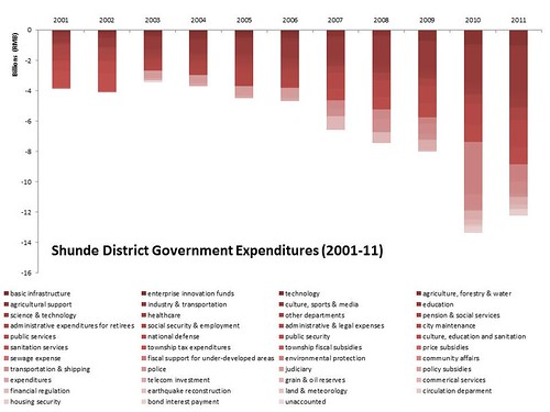
Last week, we visited Foshan to interview factories for a consulting project that Professor Huang Yasheng is doing for the Guangdong provincial government. One of our first stops in Foshan was to the ginormous Shunde District Government Office, which the locals have dubbed “Shunde White House.” The Communist Party of China has cited Shunde’s government office one of the more extravagant government office buildings. It also got me wondering: Where did the Shunde district government get the money to build the government office building? I checked Shunde district government’s fiscal budget for the past decade and came up with this graph:

Shunde revenues

It looks like Shunde district government’s revenues have been growing because they have been collecting more income tax from the companies in the region. Shunde’s government has benefited from having white goods manufacturer Midea based there. Midea accounts for 70% of the township’s GDP. Last year, Midea paid 5.2 billion RMB ($823.6 million) in taxes or almost 60% of Shunde’s income tax revenues, according to the Beijiao Economy Promotion Bureau.

Shunde expenditures

Naturally, I then wondered where the Shunde District Government was spending all of its money (besides building huge government office buildings). Surprisingly, the number one expenditure by the Shunde District Government was in education. Last year, the Shunde district government spent 2.9 billion RMB or 22% of its total expenditures on education.

Shunde deficit

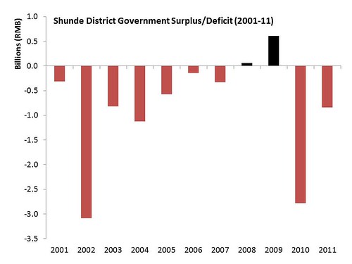
When I combined the two graphs of Shunde District Government’s revenues and expenditures, it turns out that Shunde has had a deficit in 8 out of the past 10 years. The only two years when Shunde didn’t report a deficit were in 2008 and 2009, which is a bit ironic since the financial crisis was pushed most other governments further into debt.

A lot of local governments took on debt in 2008 and 2009 to invest in transportation infrastructure projects to get through the financial crisis. The National Audit Office came out with a report in June 2011 estimating that China’s local government held a cumulative 10.7 trillion RMB ($1.7 trillion) in debt at the end of 2010. Some policymakers and academics in China have been starting to get a little concerned because 17.17% of the debt needs to be paid back last year and this year.

The capitalist network the runs that world?

Hey everyone!

So I didn’t do a cool data project, but wanted to see what everyone thought about this one:

http://www.newscientist.com/article/mg21228354.500-revealed–the-capitalist-network-that-runs-the-world.html

It was from last year. How strong is the data and the graph?

The 1318 transnational corporations that form the core of the economy. Superconnected companies are red, very connected companies are yellow. The size of the dot represents revenue (Image: PLoS One)


What James Ibori Stole

For this week’s datajournalism assignment, Godwin Nnanna and I looked into the admitted theft of $250 million of Delta State money by James Ibori, who pled guilty in London in late February. (get the data)

We wanted to find out just what he stole, explain how it fit into the context of corruption more generally in Nigerian states, and clearly illustrate the magnitude of his actions. We’re still working on the article.

Data Collection

To tell this story, we needed information on what Ibori stole as well as more general information about Nigerian government budgets. We had to compile our own datasets from a variety of incomplete sources.

  • The Metropolitan Police Press Bulletin contained detailed information about the guilty plea, including addresses, value amounts, and photographs of Ibori’s highest value assets. This information was the basis of all of the newspaper reports we saw.
  • Values were not provided for some of Ibori’s UK properties, so we used Zoopla’s property database to arrive at reasonable price estimates based on comparable properties in the vicinity
  • We obtained the guilty plea from the writer who covered the issue for the BBC. The prosecutor did not respond to our emails.
  • Nigerian government budget information is very hard to get, and actuals are almost impossible to obtain. We were able to cobble together enough information for the story however:
    • Godwin called contacts at the Nigerian Economic and Financial Crimes Commission
    • I scraped federal and state budget data from YourBudgIt.com, a scrappy government transparency initiative out of Nigeria’s CoCreation Hub. YourBudgIt (who launched a redesigned website today) then sent me updated data after I requested it on Twitter.
    • A number of citizens’ advocacy groups track budgets and expenses of Nigerian states. Many will look through the budget for building projects and then take photos of those projects to monitor if the money is being used.
    • Our datasource is here, which includes inline links to sources where possible

Presentation

We want to use this data to add context to the story– to tell people that focusing on Ibori’s luxury assets actually minimizes our impression of how much he stole. The assets reported by Scotland Yard account for less than half of what he stole.

James Ibori and his associates pled guilty to stealing a lot of money– half as much as the Nigerian federal government spends on agriculture in a year and several times the annual budget for education and health capital projects in Delta State, where he was governor.

Godwin argues that James Ibori is not an exception. He wanted to dig further into how money gets allocated to states in the Niger Delta and what they do with it. So we developed two more visuals. The first shows federal allocations to Nigerian states– showing just how disproportionate federal allocations are to states in the Niger Delta.

Then we created a series of dashboards for the four major delta states, showing a variety of figures about budget allocations, health, education, and poverty. Here for example is Delta State, where inequality is rising rapidly, poverty is widespread, health and education are a small part of the budget, and most of the money goes into capital projects, which sometimes go into people’s pockets rather than the infrastructure they supposedly support.

Partnerships between Techs and Journalists

This was the first time I partnered with a journalist who was unfamiliar with what it takes to write software or do data wrangling. As a result, I think we ended up doing our own thing toward the end, and I expect that we’ll have to put significant work into making our stories converge. Between the growing popularity of data pieces and Initiatives like the Data Journalism Handbook, I hope it will become easier for these collaborations to go smoothly.

Overall, I think it’s important to communicate the stylistic affordances of data journalism as well as the constraints on scope created by committing to collaborate on a data piece. Overall, I would love to learn more about successful working practices of data researchers who collaborate with journalists.

Tech Design & Recommendations

This was a *hard* project to do. Here are some recommendations:

  • We need to encourage and support more NGOs to release data alongside their reports.
  • We need to design databases which are capable of containing information about the source of figures in different rows/columns
  • We need to do more to make journalists aware of data resources in their own area, as well as support NGOs towards sharing more of their data sources with journalists
  • We could crowdsource the creation of datasets from disparate sources if we had the tools for crowd researchers to document the source of a particular number, and tools for users of that dataset to evaluate the sources of those numbers
  • Lots of organisations are independently pressuring government for the same data. A “What Do They Know” app for Nigeria which helped  them pool efforts would be awesome.