Here is my media diary for a week.
#1. Media classified by activities on contents ( + sources )

#2. Patterns of media activity on weekdays vs. weekend


Here is my media diary for a week.
#1. Media classified by activities on contents ( + sources )
#2. Patterns of media activity on weekdays vs. weekend
I started this assignment in an effort to make a real timeline out of my media consumption. I knew I wanted to track my reading speed and volume, not in some cruel optimization of reading efficiency, but rather just to see what I find. It turns out that, at least when I’m busy, I consume articles in chunks: several in a sitting, possibly with a long piece thrown in that I had been waiting to read. And I seem to read opinion, essays, and features much more slowly.
Here is the link to the animation: http://austinhess.github.io/media/
So I was pleasantly surprised when I heard about our first homework assignment for this course. As it turns out, I have been tracking and also sharing parts of my browsing activity for some time now. To accomplish this, I use an application called Eyebrowse, which was developed at MIT CSAIL a few years ago and which I took over the development of when I came to MIT. It is an application that is somewhat similar to RescueTime but instead allows users to be selective about what they track, and then shares that information publicly as a way for people to find interesting content from each other and converse with other people while browsing.
Users create an account on the website and install a Chrome extension. They can then choose to whitelist certain domains or selectively publish their visits to certain pages, which the extension tracks and pushes to their feed. You can also do other things like see who else has been on the page you are on, post comments or chat on any page on the web, or follow other people to see visits from their feed.
Here is a link to my feed: http://eyebrowse.csail.mit.edu/users/amyxzhang
And here is a screenshot:

My eyebrowse profile, showing my most recent shared browsing activity.
As you can see, my profile contains the webpages I’ve chosen to share in reverse chronological order, links to visit them, ability to filter by keywords and time, and tags added by myself. There’s a public API for anyone to play with the data themselves (http://eyebrowse.csail.mit.edu/api/v1/history-data?format=json&user__username=amyxzhang&offset=0&limit=10). There’s also a visualization page containing some dynamic visualizations with the ability to filter, save as static image, and embed as a widget on a webpage (http://eyebrowse.csail.mit.edu/users/amyxzhang/visualizations?query=&date=last%202%20weeks)
Unfortunately, wordpress.org does not allow code snippets so I can’t embed the dynamic widgets. You’ll have to visit the webpage above for those. However, here are some static images of my activity over the last two weeks:

A word cloud of page titles from webpages I visited in the last two weeks.

My browser visits broken down hour and by my top domains over the last two weeks.

My browser visits broken down by day of the week and by my top domains over the last two weeks.
One can clearly see that I spend quite a lot of time on coding websites, especially this last Monday, when I decided to spend the holiday upgrading this very application from Bootstrap 2 to 3.
Since I’ve been collecting my browsing data for a long time now (almost a whole year I believe), I can also go much further back to notice larger trends. Here are those last two graphs again except over the last year:

My browser visits over the last year broken down by time of day.
It seems that I’ve been getting better about stepping away from the computer before 2AM, at least in the past two weeks compared to the last year. And since activity on StackOverflow is a good indication that I am coding, it seems that I’ve conducted a lot of this very late at night. This graph also makes painfully clear how late I start the day on average. I’m also surprised by the presence of Mashable in the top 10, as it’s a media site I never really thought I visited often.

My browser visits over the last year broken down by day of week.
Looking at days in the week, it’s interesting to see that my coding work (or visits to StackOverflow) increases from its lowest point on Monday, reaches a peak on Thursday, and quickly tapers off once I hit Friday. My media consumption however remains fairly steady.
Now for some more high-level reflections of this whole experience. Before two weeks ago when I got this assignment, I had only whitelisted certain web domains that I was reasonably comfortable sharing with the world – things like Wikipedia, the New York Times, and various coding and research related websites. Beginning two weeks ago, in an effort to capture more of my media diet, I started whitelisting everything that remotely resembled news or media (excluding social media – I still wasn’t comfortable sharing that), so all my embarrassing visits to BuzzFeed and random gossip sites were also tracked and shared. The experience was really interesting to me not just to see what I had visited and notice trends, but also in a meta way to see how my tracking and sharing of my browsing history caused me to browse differently. Particularly this experience made me much more mindful of my media consumption and careful and picky about how I chose to spend my time online. For instance, in Eyebrowse, there’s a feature that makes it possible to at any moment turn off all tracking on even whitelisted domains, effectively turning off Eyebrowse as if it were in incognito mode. By having that option available, I became more thoughtful and aware of what I was doing when I had the option to choose to be privately or publicly browsing. And while tracking and visualizing the data played a role in that, it was the added step of then having that data be shared and choosing when and what data to share that made me very conscious of my bad (and good) habits.
While I hadn’t explicitly developed Eyebrowse for this purpose before, this experience has made me think of the potential benefits of a social app like Eyebrowse towards not just monitoring but keeping accountable one’s goals for their information diet. Indeed many current applications related to maintaining exercise habits and food diets incorporate social sharing to provide a measure of accountability and support. And after all, why shouldn’t we be as mindful of what we feed our minds as we do our bodies? If you have any thoughts around this, I’d love to hear it! As I continue to develop Eyebrowse, I will work on adding features to make this process easier, included better aggregate statistics and visualizations and easier ability to share these reports (like little media diaries!) on social media and personal websites. I’ll also build in more levels of obfuscated sharing, for instance the ability to share that I’m on Facebook but not specific pages.
If you’re interested in seeing where this goes, I encourage you to try out Eyebrowse! I’m still actively developing it and would love to get some more users as well as any feedback and bug reports. I haven’t released it to the public or anything yet – just publicized it around MIT CSAIL and my research group – so the only people using it right now consistently are me and my advisor, David Karger. By default, nothing is tracked when you install the extension. If you have more questions, feel free to contact me (axz@mit.edu) or read our FAQ: http://eyebrowse.csail.mit.edu/faq.
As many other members of the class did, I began this assignment by using RescueTime to track my computer activities over the course of the last few weeks. Before I launch into my analysis of the statistics that the app collected for me, I’d like to mention a few caveats:
Alright, caveats aside, here is what RescueTime revealed:


Perhaps the most important line:
![]()
For the first few days, I tried to manually log some of my news sources:
2/5/15:
2/6/15
(end of my attention span when it comes to manually logging this information)
I started using Pocket to avoid having three hundred tabs open at any given moment, but quickly discovered that for me, out of sight pretty much meant out of mind, and I rarely came back to those news articles.
The bottom line here: I spend a gross amount of time on gmail and Facebook, and my computer usage is highly unproductive. None of this is really a surprise to me. It basically revealed a massive underlying level of media distraction in my life.
I have recently been spending a lot of time thinking about attention, focus, productivity, and cognitive space – mainly because my first semester has passed and now I feel a lot more pressure to accomplish significant things (blah blah blah). Part of this has led me to think more about making space to write, reflect, explore, and think. One of the themes that keeps coming up in my explorations is the idea of crafting physical space to promote (or prevent) certain actions. With that in mind, I decided to create a type of “map of my desk space” to further unpack my media consumption.
It ended up looking a lot less a desk and more like a 3D bar chart: the diameter represents the frequency of visits to the site/medium, and the height represents the amount of time I spend per visit/use of the medium, so the volume represents approximate total time spent engaging in the medium. I collected this information through a combination of RescueTime, estimation, and timers.
Here is the key (unfortunately, the colors did not come out super well):

Laying out my “desk” space forced me to think about how I mentally organize my sources of information. Ultimately, I realized that I understand and focus on concepts better when I see them on paper, but that for things like news, things that are temporary, I typically need to use digital media. I attribute this to the rapid turnaround rate – physical versions of these would pile up incredibly rapidly. Based on this understanding, I separated the categories into “static” (i.e. textbooks, papers, books read for fun, patents, etc.) and “dynamic” (Facebook, Twitter, email, websites/blogs, NYT, BBC, Snapchat News, Messaging).
 (top view)
 (side view)
Gmail (the green blob), was my most frequented site (large diameter), but I used it for relatively short spurts each time (so it is a short bar). Similarly, the Facebook bar is almost flat as I only ever briefly scan through Facebook, but I do so incredibly frequently. Conversely, the papers bar is very tall, but has a small diameter- I only sit down to read papers once or twice a day, but when I do, I spend hours on that task.
Looking at this arrangement, I was curious about the sources of my information. I already know that I receive an alarming amount of my news from messages, word of mouth, or Facebook, but I wanted to further explore my influencers. I arranged my bars into a venn diagram:


I am, by nature, a highly social and socially influenced individual, so it was not entirely shocking to see how much of my media came from friends and outside sources. It is interesting to note that the things I spent the most time on originated from a combination of my friends and my own investigations. I found this to be both reassuring and logical – that is the most interactive and dynamic space.
One aspect of my media consumption that was not captured with this framework was that I read much faster when read on paper. I’m not entirely sure how this factors into my scaling plan, but it certainly impacts how much information I process. It also does not account for the difference between time periods: I happen to be a morning person, so for me, not all hours are equivalent. I’m much more efficient in the morning, so it takes me less time to get through content and effectively process it than it would at night. Based on my RescueTime stats, I’m trying to consolidate my email time rather than spreading it throughout the day, but it’s sometimes difficult to find the appropriate space to conduct email sifting.
The final aspect of my media consumption that I did not examine was the location of engagement. For instance, do I read most of my papers at my desk? Do I read the news on the T? I know I mostly listen to podcasts on the way to work, and I mostly read for fun on my couch, but in the future it may be interesting to explore any correlations between location and type of media.
Overall, I learned that I am easily distracted and potentially very unproductive. There is a lot of room for stream-lining, and it might be worth reconsidering my (lack of) consumption of traditional news sources.
The first thing that came to mind when we received this assignment was to play with the idea of teenager diary. I had just attended a few classes on animation and decided to use the program After Effects as a tool to tell this story. Subjects as the inclement weather, the death of David Carr and water shortage in São Paulo caught my attention between moments lost in e-mail reading and Carnaval songs searching.
As an editor, I consume a lot of media for work. I tried a few different ways to slice the seemingly mundane data that I collected in my media log and found myself focusing again and again on voices and who they belong to. Who is the author? Where is she from? Where are her sources from? Has she ever met them face-to-face? These questions I found myself asking again and again as I jotted down my daily tangle of tech and international news, NPR podcasts, and even late night “fake” news shows.
Perhaps more interesting than what I found in static (i.e. not evolving during the time of consumption) media was the information that I gathered on email lists. Global Voices is known as a community of bloggers and activists around the world – while we’re best known publicly by our site, if it wasn’t for our email lists, I’m not sure how we would have become a community to begin with.
During the first week of February, a really moving discussion played out on one of our community lists. A contributor from Tunisia wrote to the group and shared a link to a press release from the Kingdom of Bahrain that enumerated 72 people whose citizenship it had elected to revoke. Among these people was another contributor of ours, Ali Abdulemam, who now has political asylum in the UK. I learned a lot in that week from the conversation that played out over the list. Here is a colored pencil rendition of the conversation:

The increase of knowledge over time in a GV list discussion.
Each dot represents a message sent to the group. The color of the dot denotes the country that the sender identifies as his or her home. For each message, I made a rough (highly subjective) calculation of how much new information it contributed to the conversation. The line at the top of the graph indicates the total amount of information accumulated over time. In the end, we all learned about Ali’s story, but also heard stories from contributors in Egypt and Azerbaijan who had taken exile from their countries under similar circumstances. Towards the end of this record of the conversation, we decided to produce a series of stories on Global Voices focusing on citizenship and border crossing in the world of digital activism.
The second graphic hones in on question of voice and sources. While editing stories on all of the countries listed below, I read multiple stories and pieces of research focused on each the relevant issues in each place.

Percentage of stories that quoted a source in the country.
A few noteworthy findings:
Cuba: During this week, Netflix declared their aspirations to begin offering service in Cuba. Most English language media reporting on the story quoted only a press release from Netflix, which of course failed to acknowledge the fact that almost no Cubans have enough Internet connectivity to watch video online, nor do they have the credit cards with which to pay for the service. I edited a story by fellow classmate Elaine Díaz on the topic, which of course illuminated these facts.
Bahrain: I edited two stories that week on Bahrain, both of which focused on the stories of individual activists and bloggers, and both of which drew heavily on sources from those peoples’ friends and relatives.
Russia: Global Voices coverage of Russia consistently draws from social media commentary from users in the country. I read several of our previous articles in order to edit one that offered new information on a series of social-media related arrests. I should note that while all of these pieces quoted local voices, their authors are not Russian, nor do they reside in the country.
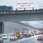
This week, I consumed radio, podcasts, a TV show, a movie, books, paper newspapers, some magazines, and lots of online media, including text, video, and other visual media. I also listen to Pandora almost continuously. But here’s a sampling of 10 stories I followed down the rabbit hole — what they were, how I got there, and what I read.


This is my first time attempt to picture my media consumption pattern in a graphic. Enjoy!